5 Innovative and Inspiring Data Visualizations

Data visualizations don’t always require screens or complex software. In many cases, analog representations have emerged that, by combining creativity and clarity, manage to convey information in a powerful way, creating meaningful impact that goes beyond the numerical. These visualizations explore new ways of representing information, breaking away from conventional approaches and showing how art and design can enhance the communicative potential of data. Below, We present five visualizations that break away from traditional ideas and serve as a source of inspiration for us at Datasketch to create innovative proposals that challenge how we visualize and understand data.
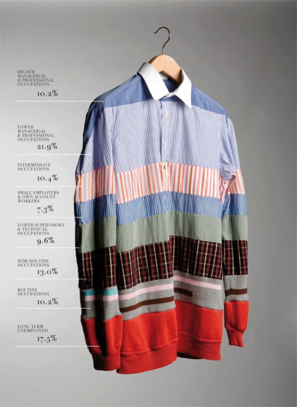
1. Representing Social Order by Gareth Holt
This project by Gareth Holt uses everyday objects to illustrate social data. One notable example is a shirt made with different types of fabric, employing the concept of a “textile bar chart” to represent the structure of social classes. In this design, the width of the fabric reflects the percentage of the population in each social class, starting with fabrics representing the daily attire of higher social ranks at the top and descending to materials that symbolize unemployed individuals.
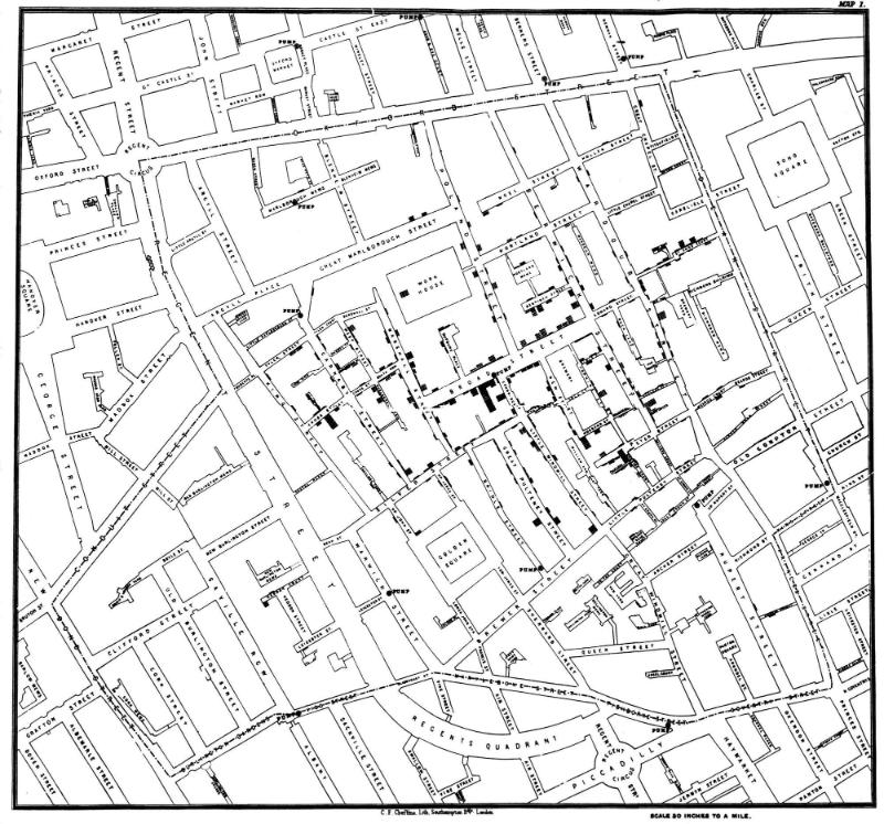
2. Broad Street Cholera Outbreak Map (1854)
John Snow revolutionized epidemiology with a map showing the concentration of cholera deaths in a London neighborhood. Using small bar charts on each city block, he identified the epidemic’s source: a contaminated water pump. This visualization not only revealed critical patterns but also spurred urban sanitation improvements that saved countless lives.
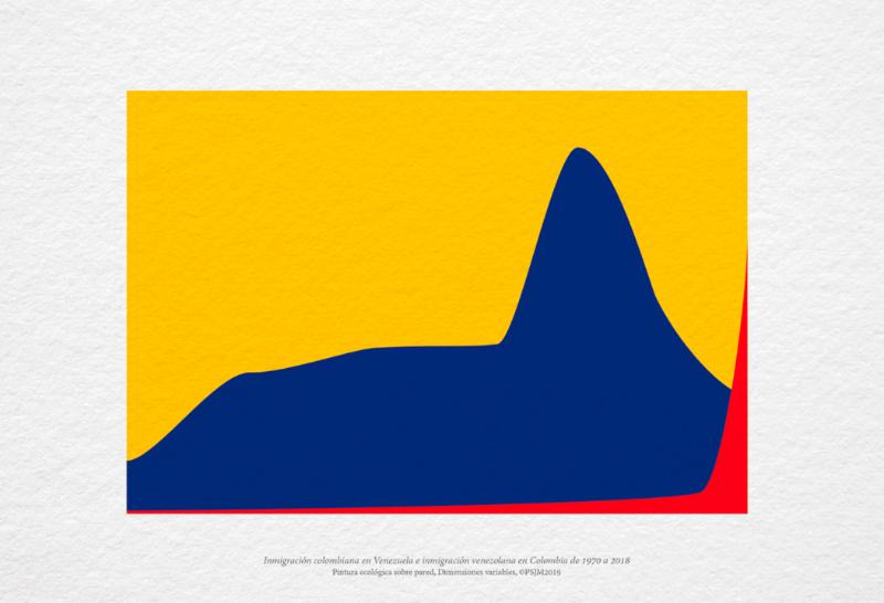
3. Colombian Immigration to Venezuela and Venezuelan Immigration to Colombia (1970-2018) by PSJM
This mural by PSJM creation team, part of the “Social Geometry” series, represents migration flows between Colombia and Venezuela using a line chart painted on a wall. The x-axis represents the years, while the y-axis shows the number of migrants. Colombian migration is depicted in blue, and Venezuelan migration in red. More than a simple chart, this piece transforms the data into a compelling visual story about the shared history of the two countries.
4. Coat [-4 … 24.8]^14.9 by Gabriel Zea
Gabriel Zea brought data visualization into textile design with his coat [-4 … 24.8]^14.9. This garment represents Bogotá’s minimum, average, and maximum temperatures over a year using color stripes. By wearing it, the city’s climatic information becomes a sensory experience, offering a tangible reminder of Bogotá’s variable weather.

This product is available at the Datasketch Store. Find it here.
5. Warming Stripes by Ed Hawkins
The “Warming Stripes,” created by scientist Ed Hawkins, are a minimalist representation of climate change. Through color stripes arranged chronologically, they intuitively display the increase in global temperature. This design has been adopted in clothing, book covers, and even building facades, becoming a powerful visual symbol of the climate crisis.

These visualizations show that data can be more than just numbers. They can be powerful tools for raising awareness and transforming realities. If these innovative proposals inspire you, we invite you to explore more at the Datasketch Store, a design shop with social impact that aims to democratize access to knowledge and provide information on crucial issues in our society. Through data-driven products, we inform and raise awareness about gender, anti-corruption efforts, human rights, and the environment.
