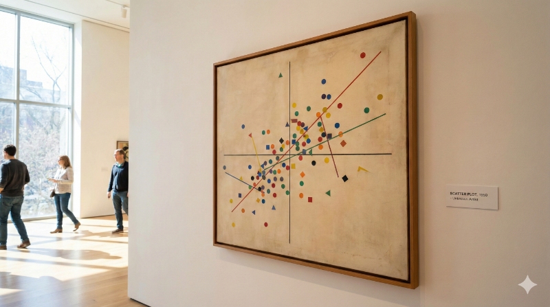
Data Visualization: Scatter Plot (or Correlation Chart)
At Datasketch, we walk you through everything you need to know to create scatter plots, also known as correlation charts.

At Datasketch, we walk you through everything you need to know to create scatter plots, also known as correlation charts.
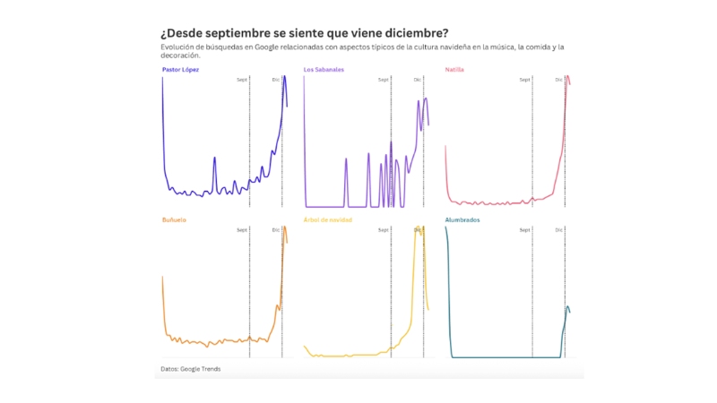
Read this blog to explore how Google searches reveal when interest in Christmas begins in Colombia.

A conversation with Economía para la Pipol on the Datasketch video podcast about data, technology, and economic storytelling.

At Datasketch, we’re exploring what AI can do, but always with a critical lens. Here are five everyday situations where you shouldn’t rely on it blindly.

At Datasketch, we’ll show you how you can integrate AI into your data workflow to save time and multiply your technical capabilities.

The information generated by AI tools is not neutral: it reflects the biases present in the data and in design decisions. At Datasketch, we explain the different types of biases and how to identify them

Based on the conversation in our videopodcast, we share the main lessons and challenges we’ve encountered at Datasketch over the ten years since our founding.

This design represents 100 ways of naming friendship in Spanish, highlighting the versatility of the language and its variations across different social, cultural, and geographic contexts.

Discover the top 3 free tools to turn your audio into text—fast, accurate, and easy to use.

Insights from our Videopodcast on how AI is transforming journalism.

In this blog, we share how opening, integrating, and leveraging the data produced by academia can transform research and amplify its impact.
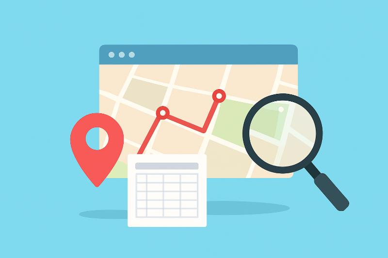
At Datasketch, we explain what you should keep in mind about geographic file formats when creating maps.

Here’s how to create a pictorial chart to visualize percentages in a creative and engaging way.

Here’s what we learned from making fanzines with data.
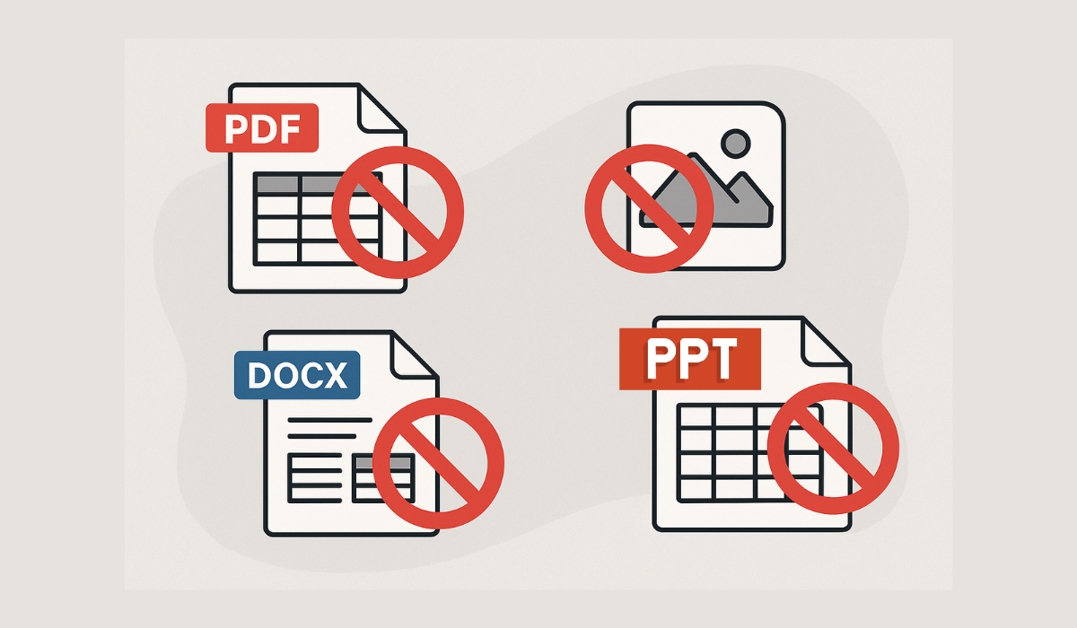
When working with data, certain file formats can create unnecessary complications. In this post, we’ll show you which ones to avoid.

Learn how to generate color palettes from an image using our Image Palette extension
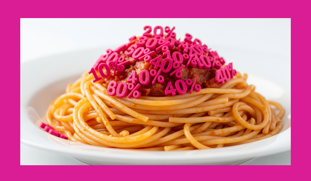
Have you ever designed a Sankey diagram only to find it confusing? Chances are, you're making one of these mistakes. Avoid them!
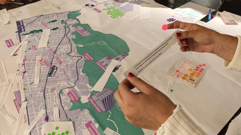
At Datasketch, we believe data isn’t just for analysis — it can be touched, used, worn, and serve as a powerful tool for sparking conversation. That’s why we created Datasketch Lab, a space for creation and experimentation where we take data beyond the screen and bring it into everyday life.
Explore the complete list on our platform and find the data source you need for your next project, report, or investigation.

Despite the many challenges social organizations face when working with data, those that overcome them can unlock new ways to scale their mission and amplify their impact. Here's how.
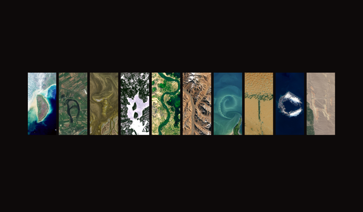
Would you like to access satellite imagery data but don’t know where to start? This blog will give you all the information you need.
At Datasketch, we’ve selected nearly 100 key terms to help you understand data and technology. Here’s why we did it—and why it might be useful for you.
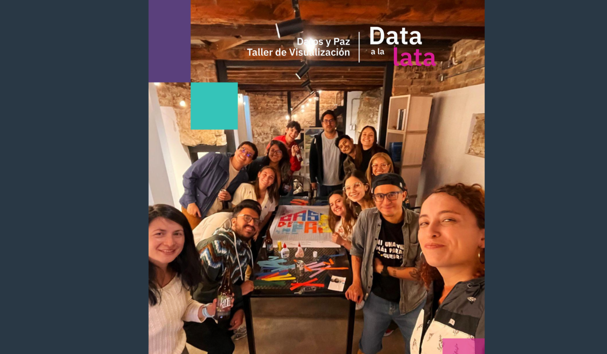
In our latest Data a la Lata session, we joined La Trocha to explore how data visualization can help communities make their peacebuilding work visible—on their own terms and in their own words.

Here’s why using data in journalism is an opportunity to innovate and connect with audiences.

At Datasketch, we believe in the power of data to drive social impact. Here are five recent projects we’ve contributed to.
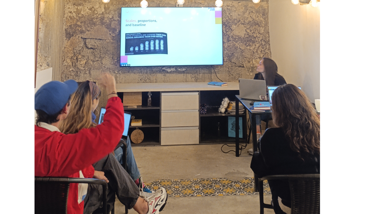
Yesterday at Data a la Lata, we held a book club to dive into one of the most relevant topics of the digital age: how charts can lie. We read How Charts Lie by Alberto Cairo—a book that encourages us to think more critically about the visual information we consume every day.
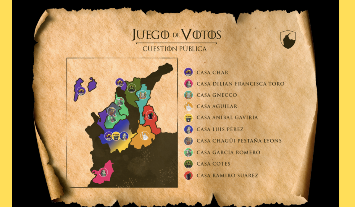
In a healthy democracy, citizens need clear and accessible information about those who aspire to represent them. When this information is complex, scattered, or hard to interpret, the power of decision-making is weakened. This was precisely the challenge we faced when collaborating with Cuestión Pública on one of their data journalism projects: Game of Votes.
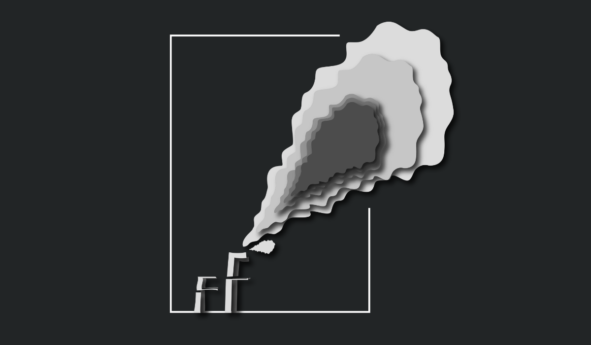
The smoke area in this design represents the five countries that have emitted the most CO₂ from 1750 to 2024, as a result of fossil fuel use and industrial activity. The United States, China, Russia, Germany, and the United Kingdom have been responsible for 56% of cumulative emissions since the Industrial Revolution.
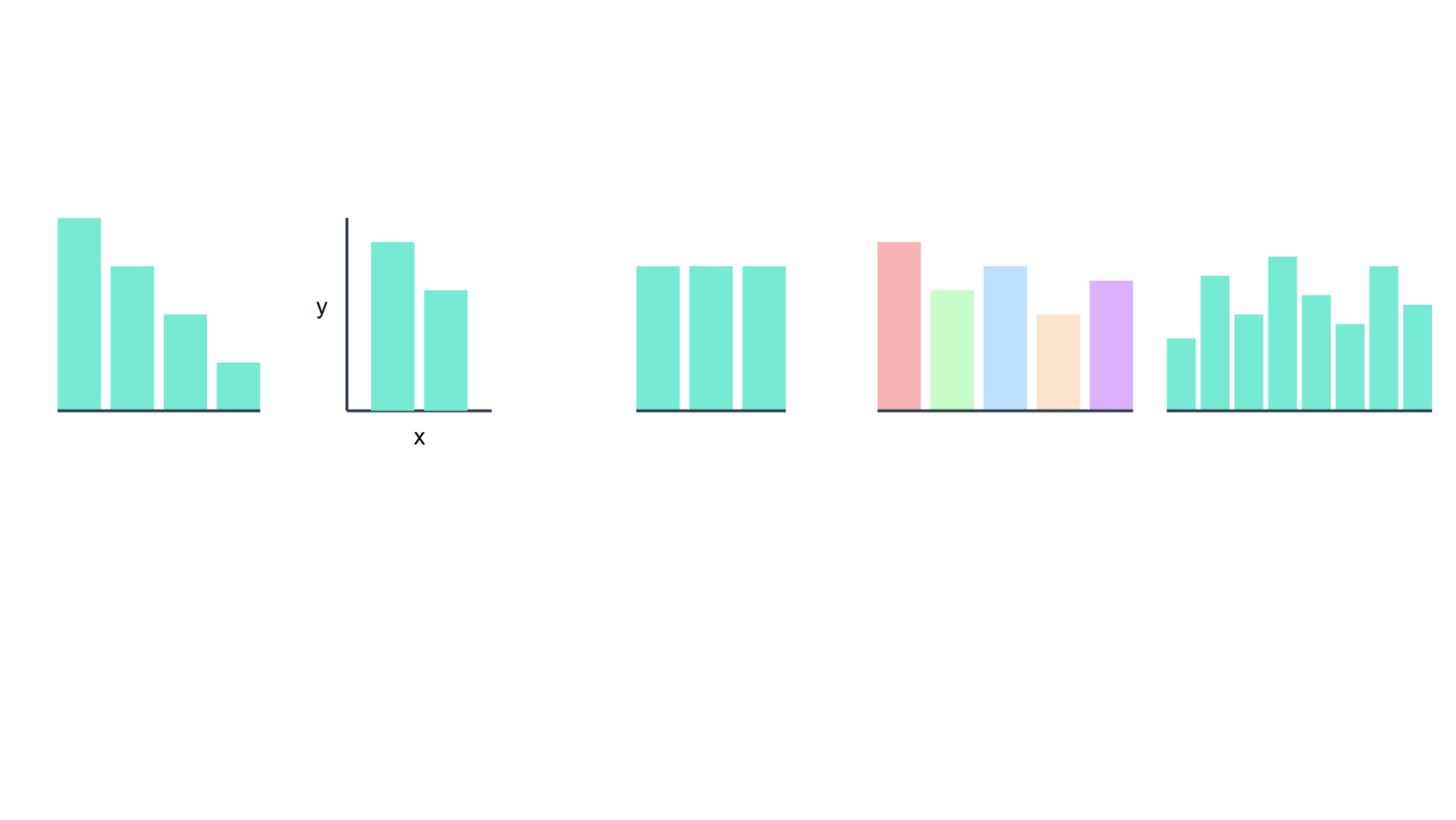
Have you ever created a bar chart, only to find that people struggle to understand it? You might be making one of these common mistakes. At Datasketch, we’ll show you what they are and how to avoid them.
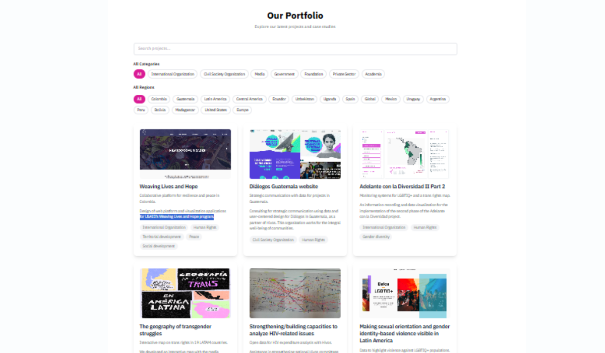
At Datasketch, we've worked with organizations from Mexico to Uganda. Learn more about our work in 100 projects.

We analyzed the data from the events we've participated in—both as organizers and guests—throughout our ten years of existence.
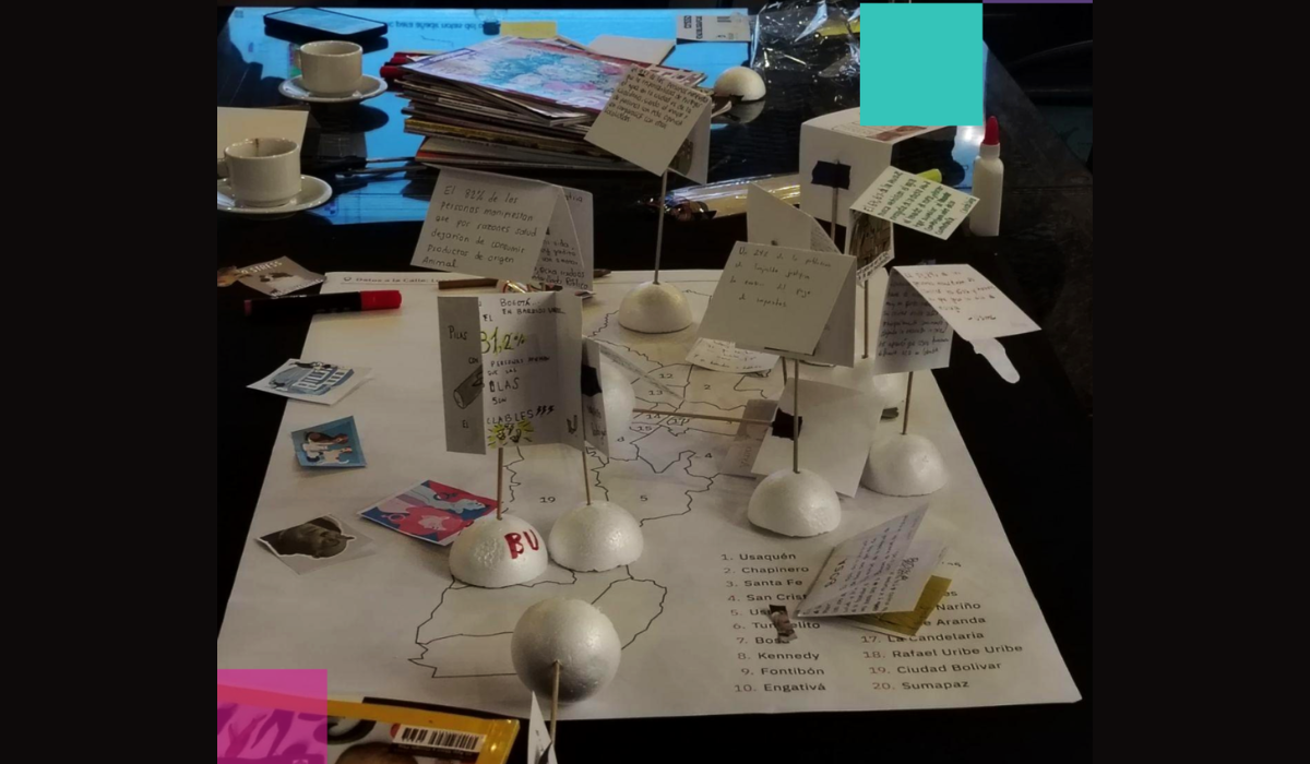
Discover how data can tell stories about the places we inhabit. A recap of four events where we connected sound, visuals, and everyday life with data science.

40 developers, designers, and curious minds gathered in Bogotá to explore how AI-powered coding is democratizing development and changing the way we build things.

Here we present 5 unconventional data visualizations that inspire us to think about data from different perspectives.

Here we explain what open data portals are and how their existence promotes transparency

We are closing the digital gap faced by small newsrooms in amplifying their impact. Discover the case of Tiny News Collective (TNC).
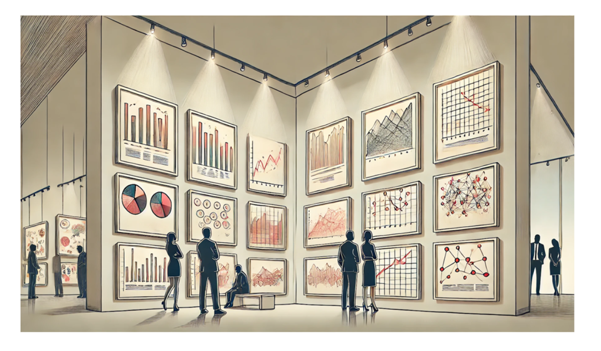
Discover more than 100 ways to visualize data in our gallery

Projects and insights from my week using AI tools and techniques

How I built an AI journalist to pull ideas out of my head

Find out which countries have historically emitted the most CO₂ from fossil fuels and industrial activity.

Every three seconds, somewhere in the world, a girl is married before turning 18. This shocking statistic represents one of the most persistent human rights violations globally.

How we did in our event to explore New York City's Spanish-language publishing ecosystem through a data lens.

This month, we highlight the connection between data and culture by celebrating two of Colombia’s most iconic literary works. Through our data analysis, we uncover fascinating insights into the search trends surrounding these masterpieces.

Have you ever wanted to create a map but didn’t know where to start? At Datasketch, we’ll walk you through everything you need to dive into the world of data visualizations with maps.
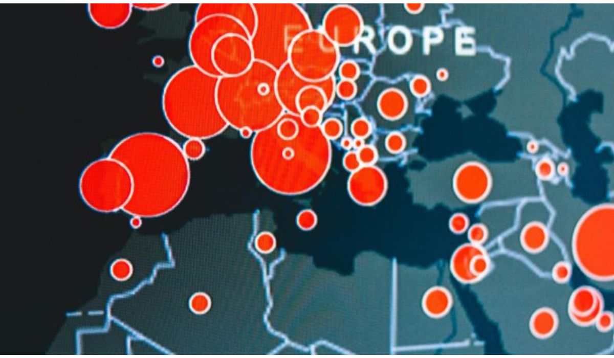
At Datasketch, we explain what a bubble map is and how to use it correctly to visualize your data.
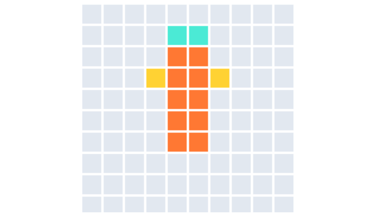
At Datasketch, we explain what a Waffle Chart is and the key points for using it correctly.

At Datasketch, we explain how to transform flat tables into powerful visualizations that make data easier to understand

A responsive graphic not only enhances user experience but also ensures that information is comprehensible in all contexts. Here’s what it’s all about

What Connects Spanish-Language Authors to New York?
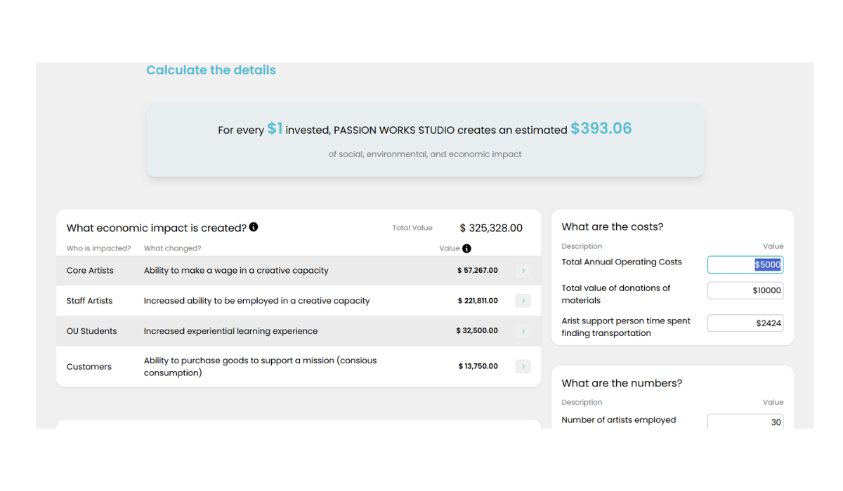
Learn how Ohio University revolutionized social return on investment (SROI) calculations with an innovative web calculator, improving efficiency and accessibility for measuring social impact
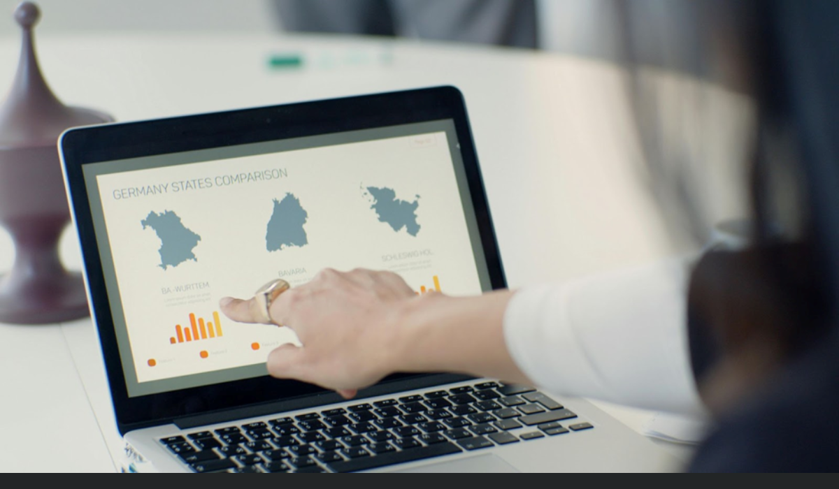
Choropleths, points, and lines are the most common and effective types of maps for representing geographic data. Here, we explain how and when to use each of them.

Women spend 3.2 times more time on unpaid care work than men globally.

In emerging economies, advanced data analysis tools are often inaccessible to small businesses. Through Strive Community and the Mastercard Impact Fund, we developed digital solutions to help small businesses increase profitability and promote inclusive economic growth.
Documenting the journey of selling $500,000 in 3 months.

Learn about the persistence of femicide in Latin America and the Caribbean through data.

Sudan, Syria, Congo, Colombia, and Yemen are the countries with the highest number of internally displaced people due to conflict and violence. Learn more about this global crisis on our blog.

Learn how to create clear and effective data visualizations. Discover five key steps to designing graphs that communicate information accurately and attractively

You’ve probably heard of them, seen them, and even created one at some point. In this article, we’ll explain why data visualization is important and how graphs can transform the way we understand information.

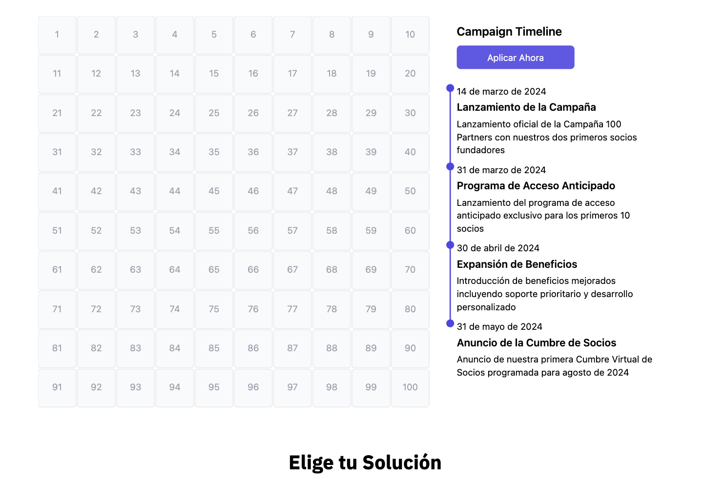
We are launching an ambitious campaign to partner with 100 organizations in 100 days, offering AI-powered tools to democratize data analysis. Join the revolution!

Colombia ranks first in the world for butterfly diversity. This number reflects the country's extraordinary biological wealth and its importance for the global conservation of these insects.
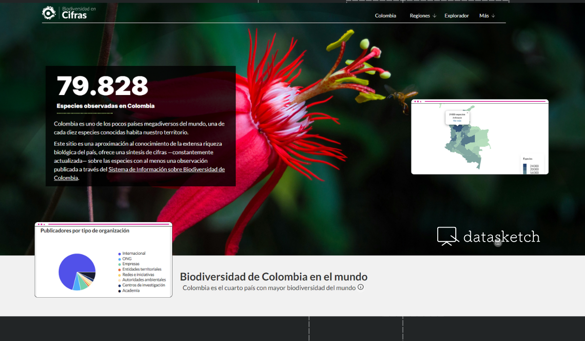
The Alexander von Humboldt Biological Resources Research Institute is the entity responsible for promoting, coordinating, and conducting biodiversity research in Colombia. We build their web platform that transforms complex scientific data into clear and accessible visualizations.
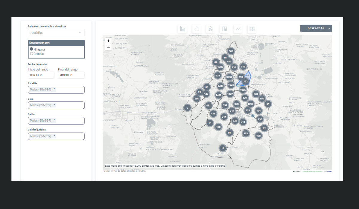
The Digital Agency for Public Innovation (ADIP) of Mexico City is the organization responsible for designing, implementing, and overseeing the digital agenda and technological innovation in one of the world's largest metropolises, serving more than 9 million inhabitants.

Choosing the right chart is key to visualizing our data in the clearest and most powerful way possible. For this reason, at Datasketch we present seven types of charts you can use to represent data that sum 100%.
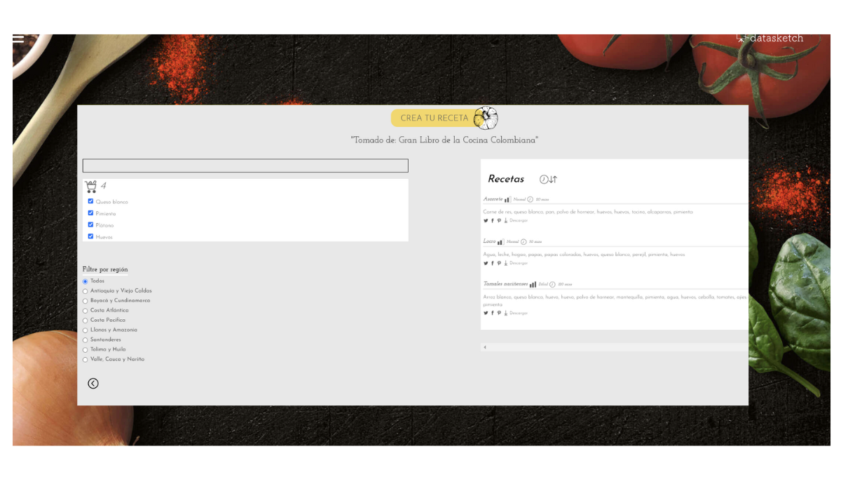
Colombian gastronomy knowledge, documented for decades in the Great Book of Colombian Cuisine, remained in a traditional format that limited its access and analysis. Through text extraction, data cleaning, and validation by culinary experts, we have transformed this culinary heritage into a dynamic tool that allows exploration, analysis, and discovery of more than 700 traditional recipes.
Digital transformation has led restaurants to face an unprecedented amount of information that needs to be managed. Currently, these businesses face the challenge of converting large volumes of data into strategic decisions that drive their growth. We present five challenges that food establishments face in managing their data.

América Abierta is one of the most anticipated events on open data in the region. In this article, we share details about the contribution Datasketch will bring to the event.
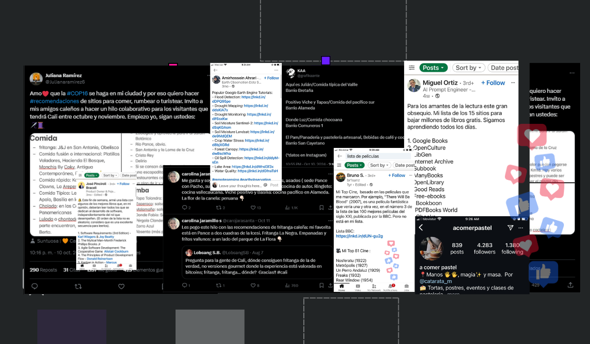
Small data is everywhere on our social media feeds: from saved recipes on Instagram to recommendation threads on X (formerly Twitter). While these individual pieces of data might seem insignificant on their own, they become powerful sources of information when organized and connected. In this article, we explore the power of small data and how organizing it can transform personal experiences into collective knowledge.

A tech revolution is brewing for small businesses, and at Datasketch, we're leading the charge. Our mission is to democratize data science and artificial intelligence (AI), making these advanced tools accessible to enterprises of all sizes.

This design provides a detailed analysis of the major regions and subregions involved in global arms imports from 2000 to 2023. According to SIPRI data, Asia and Oceania have emerged as the regions with the highest import volumes, accounting for 42% of the global total. Within this region, India stands out as the top importer, holding a 9.9% share of global arms imports.

At Café Datasketch, we combine gastronomy with data technology. Our menu continuously adapts through data-driven decisions, offering dishes that stand out for their flavor, sustainable origins, and social value. With our app, every change is automatically updated in the menu, without the need for additional resources, optimizing daily operations and enhancing our customers' experience.

The soccer balls in this design represent the disparity between the total prize values awarded by FIFA in the last men's and women's professional football World Cups. While $440 million was allocated for the men's World Cup in Qatar 2022, women received only 25% of that amount, i.e., $110 million for the Australia/New Zealand 2023 World Cup.
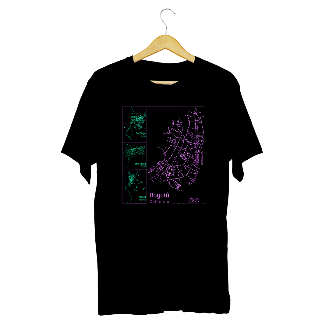
According to the 2022 Cycling Cities Index, Santiago de Chile, São Paulo, Mexico City and Bogota stand out as the most bicycle-friendly cities in Latin America. In the evaluation of the cities, cycling infrastructure was taken into account, with Bogota's 608 kilometers of permanent bicycle lanes standing out.
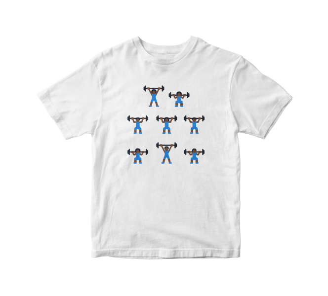
Until the Rio 2016 edition, Colombia has earned a total of 8 medals (represented by each figure) in the weightlifting category at the Olympic Games since 2000 when María Isabel Urrutia won gold. The height at which each weight is lifted corresponds to a different type of medal: the highest is gold, the middle is silver, and the lowest is bronze. In the Tokyo 2020 edition, Luis Mosquera added one more medal to our count, which is why we updated the database that inspires this design.
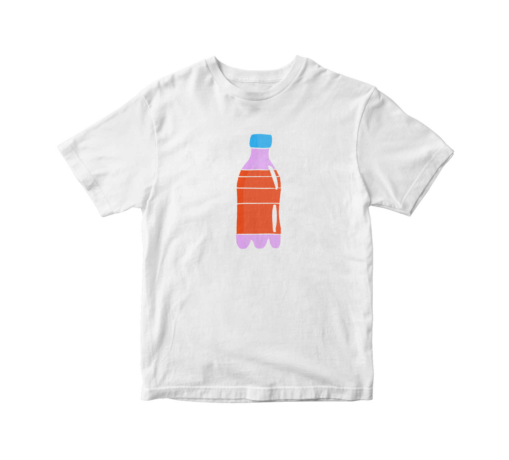
In the Pacific Ocean, between Hawaii and California, a vast expanse of trash known as the Plastic Continent has formed, covering an area of 1.6 million square kilometers. To put this into perspective, this area is equivalent to combining the Latin American countries of Chile, Paraguay, Ecuador, and Surinam.

According to data from a Mother Jones investigation, mass shootings in the United States from 1982 to 2019 have left a total of 2340 victims, of which 934 were fatal.
Media | Public Procurement | Elections
Migration | Human Rights | Xenophobia
Economy | Sustainability | Aging
Rights | LGBTIQ+ | Americas
It’s simple and fast. Let’s start.
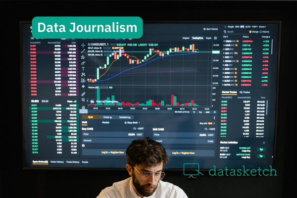
Story telling | New Perspectives in Communication | Big Data
Projects | End of the year
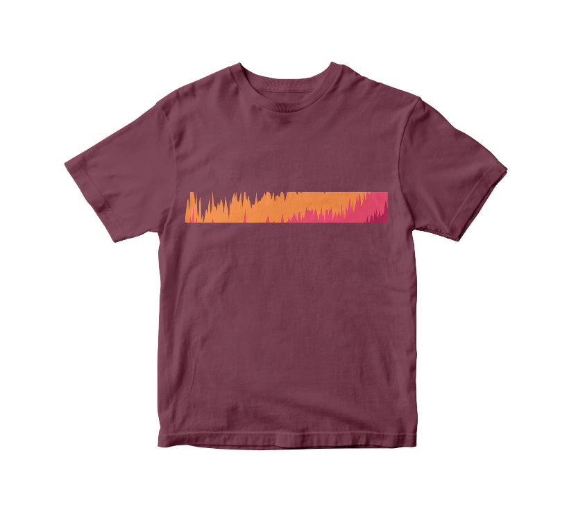
We made a visual representation of global temperature changes since 1919. This one illustrates the increase in average temperature, according to Berkeley Earth data.

The Political Participation in the Colombian Congress, as is the case in other parts of the world, shows large disparities between men and women. This design shows the long way to go to reach parity.
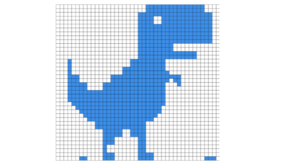
According to the International Telecommunication Union, one third of the world's population do not have an internet connection in 2022. The pixels of this T-Rex dinosaur indicate that ratio.

Red flags indicate potential corruption risks in procurement processes. They can be defined as red flags, clues, or indications of possible irregularities. They are a very useful tool to identify corruption and promote transparency.

According to the Inter-Parliamentary Union, women comprised 26.1% of parliaments worldwide by January 1, 2022. The beads of this necklace show the percentage evolution from 1995 to the present with the change in the hue of yellow.
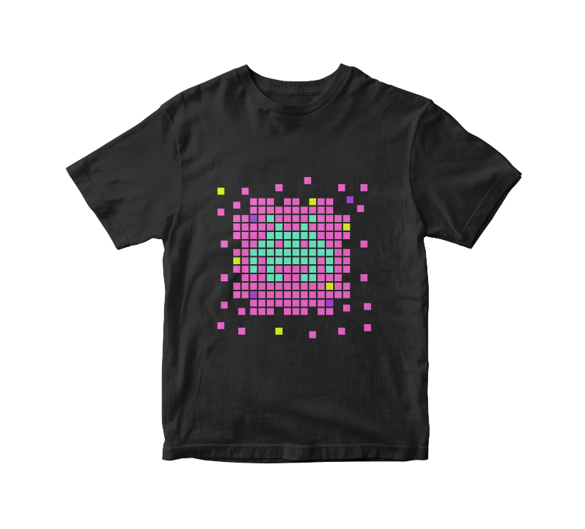
The International Game Developers Association conducts an annual satisfaction survey of game developers around the world. It shows data on the number of men, women and non-binary people in the industry
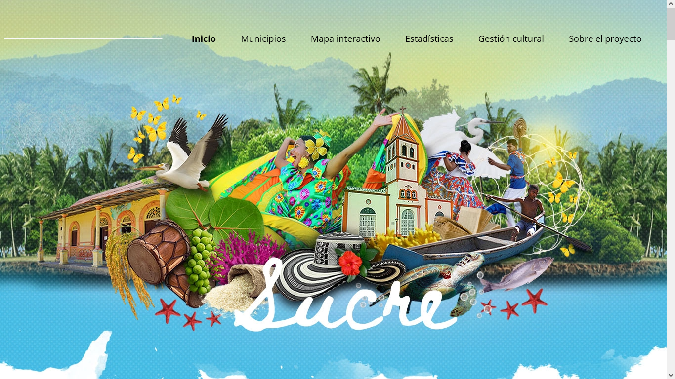
The Sucre Information System and Cultural Map had its premiere on May 13. Datasketch worked on data structuring, design, visualizations and web implementation.
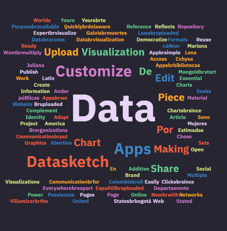
Data visualization is usually related to graphical representations of numbers, but when the information to be displayed is textual you can use a word cloud.
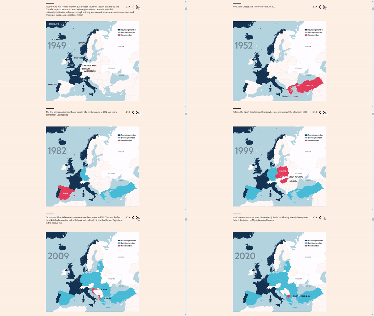
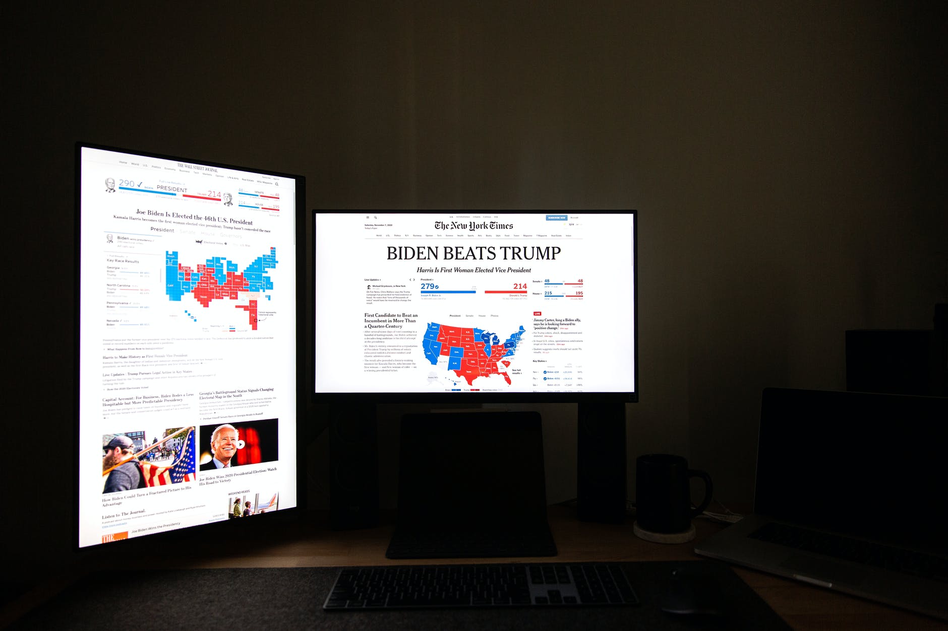
The media have focused their attention on the tension between Russia and Ukraine. Their graphics and data journalism teams have brought out their artillery to show what is happening. What do their visualizations consist of?
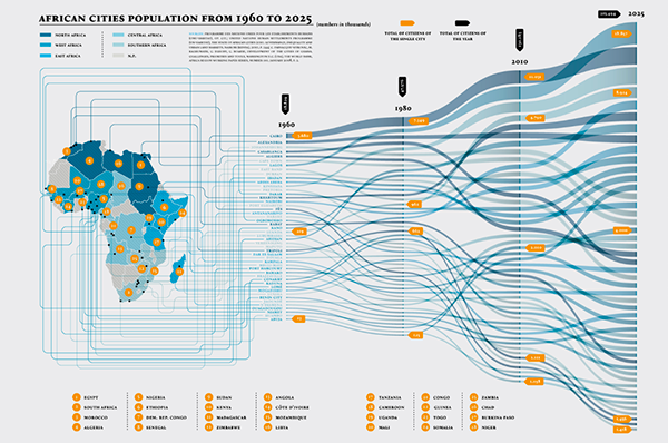
An alluvial diagram or alluvial plot is a type of visualization that shows changes in flow over time. We explain what they are used for and give you recommendations for their use with some examples.
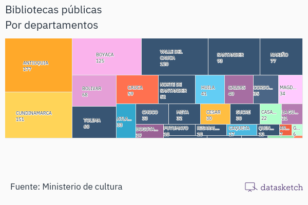
Treemap is a type of data visualization that displays data hierarchically. Here you will find its features, functions, recommendations, related visualizations, and entertaining examples.
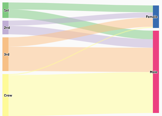
The Sankey diagram is a type of data visualization that allows you to graphically represent the flow from one series of values to another.We tell you how and when you can use it and show you how other people are using it.

We explain to you their characteristics, possible uses, and the different types of bar charts.
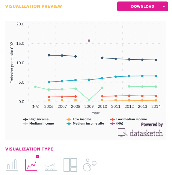
Learn how to use a line chart and when, its advantages and disadvantages and which of our apps to use to make it.
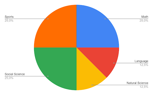
The pie chart is a pictorial representation of data that makes it possible to visualize the relationships between the parts and the whole of a variable. Learn how and when to use it.

We tell you what root cause analysis is, how and when you can use it.

"What numbers cannot communicate in a table becomes visible and intelligible when communicated visually. This is the power of data visualization". Aporta Initiative - Government of Spain

We celebrate our re-election as members of the Committee of the OGP in Colombia for 2021 - 2023. One of our objectives as an organization is to democratize access to information and strengthen public management. We have been working for it for five years.
We made a selection of the best visualizations of the Tokyo 2020 Olympic Games. Maps, medal tables, multimedia specials, and comparatives.
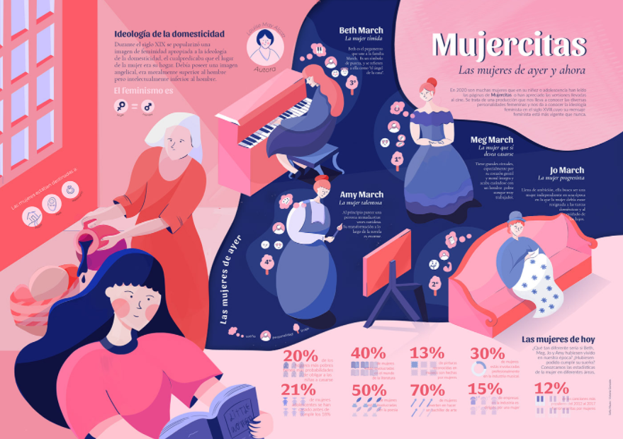
We explain what an infographic is and how we can communicate data through this graphic tool.

A selection of easy-to-use website-building tools can help you create your website to share your journalistic work and data visualizations.
If you need to create a map, you should check this tools.

How long did it take you to transcribe an interview or audio the last time you worked on one of your projects?

Here are six films that talk about journalism, question it, criticize it and give some food for thought.

All journalists must respond to the 5W, better known as the what, who, where, when, and why. Google Earth helps to answer the 'where.’
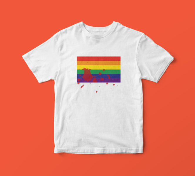
There have been registered 1,025 murders of LGBTI people in latin america and the caribbean from January 2014 to December 2018.

The massacres occurred in Colombia during the colombian armed conflict left 24,518 victims