5 Tips for Creating a Waffle Chart Without Failing
A Waffle Chart is a simple yet powerful visual tool for representing proportions and percentages clearly and attractively. With its grid-like design, resembling a waffle, this chart is perfect for intuitively showing parts of a whole, serving as an alternative to pie charts or treemaps. However, using it correctly requires following a few steps. That’s why at Datasketch, we present five tips for creating an impactful Waffle Chart.}
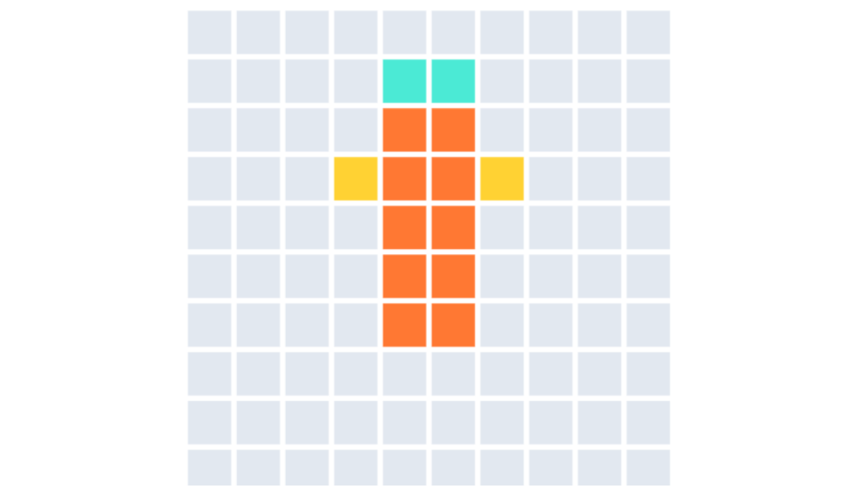
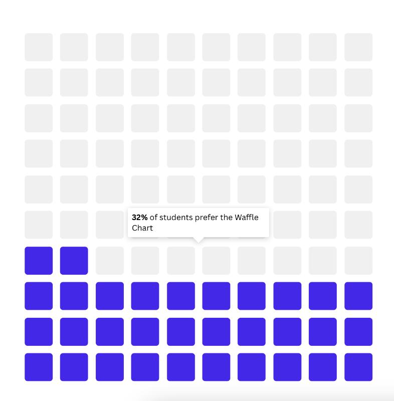
1. Limit the Number of Squares
A typical Waffle Chart uses a 10x10 grid (100 squares), where each square represents 1%. However, you can adjust the grid size to suit your needs. Avoid grids that are too large or too small, as they can make the chart harder to read. Example: To represent 32% of a total, use a 10x10 grid and color in 32 squares.
2. Define the Purpose of the Chart
Before creating your Waffle Chart, determine whether you want to present an overview with multiple colors or highlight a specific aspect. If you choose to show an overview, it is recommended to represent between two and six categories, using a color palette that ensures clear differentiation. Alternatively, if your goal is to emphasize a single category, you can color it with a standout tone while leaving the rest in gray to achieve a more focused and clear visualization.
3. Use It for Simple Proportions
Waffle Charts are ideal for showing proportions or percentages of a total, especially when you have few categories (between 2 and 6). If you try to represent too many categories, the chart may become confusing.
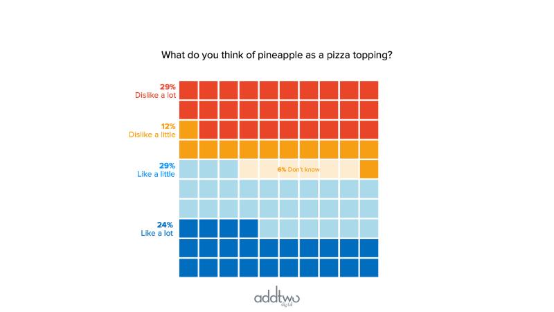
Taken from https://www.addtwodigital.com/powerpoint-charts/2023/9/1/waffle-charts-multiple-series.
4. Avoid It for Complex or Precise Data
A Waffle Chart is not the best choice when you need to display detailed data with many categories or decimal values. Its simplicity makes it less effective for presenting complex information or data that requires numerical precision. If you need to show the percentage market share of 10 products, it’s better to use a bar chart or pie chart. A Waffle Chart with so many categories would be difficult to interpret.
5. Use It in Informal or Creative Contexts
The Waffle Chart is perfect for informal presentations, creative reports, or social media, where you want to grab attention quickly and visually. However, avoid using it in technical or scientific contexts that require extreme precision.
We’re passionate about data visualization and love sharing knowledge from this fascinating world. Follow our blog and create your own Waffle Chart for free on our platform
