Through color, size, and geographic location, bubble maps allow us to visualize quantitative data across different places in an easy and visually appealing way. These maps use circles of varying sizes to represent values at specific locations. The larger the value, the bigger the bubble, and color can even add another layer of information. Here are the main uses of bubble maps:
1. Comparing Magnitudes Between Regions
A bubble map is ideal when you need to compare quantities or values across different geographic areas. The bubbles, with sizes varying according to magnitude, allow you to quickly identify where the highest or lowest values are concentrated.
Example: Visualizing the number of tourists visiting each European country in a year. Larger bubbles highlight destinations like France or Spain, while smaller ones indicate countries with lower visitor numbers.
2. Visualizing Densities or Concentrations
If you want to represent population densities, sales by region, or any metric involving spatial concentration, this type of map is your ally. The overlapping bubbles on each geographic area help understand where a phenomenon is more or less intense. Example: A map showing the population of each U.S. county. Larger bubbles represent more populated counties, mostly on the west coast, while smaller ones show less populated areas in the central regions.

3. Showing Relationships Between Location and Value
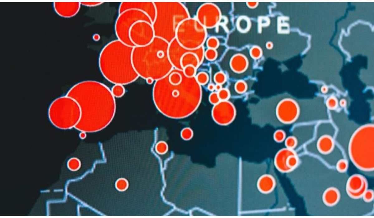
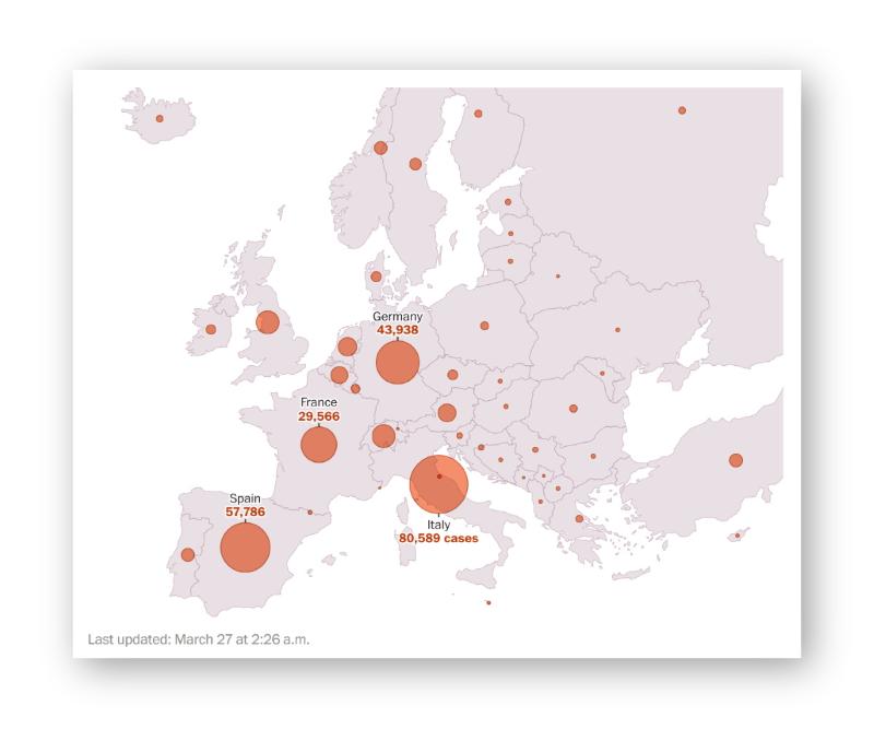
When you need to highlight not only where something is happening but also how much, a bubble map is perfect. For example, to visualize the number of disease cases by country, the bubbles let you see both the location and the severity of the issue in each place.
Example: The Washington Post created this map to visualize the number of COVID-19 cases in each European country as of March 27, 2020. The larger bubbles represented the areas with the highest number of cases, while the smaller ones indicated countries with fewer records.
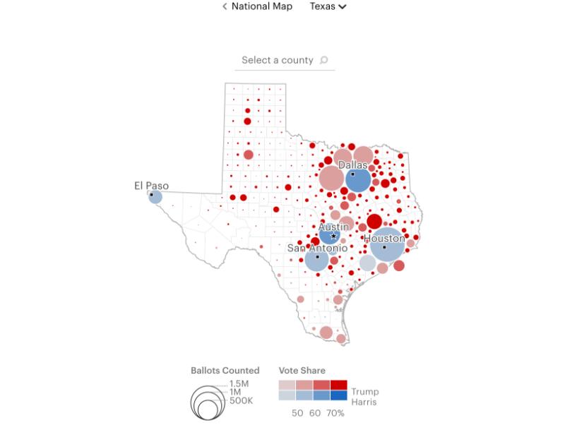
4. Simplifying Complex Data
If you have complex data involving multiple variables (location, value, and category), a bubble map can simplify the information. By using colors and sizes, you can represent two additional variables alongside location.
Example: The New Yorker created this map to visualize the results of the 2024 U.S. elections. Each county was represented by a red or blue dot, depending on the winning candidate, and the size varied based on the number of votes received.
At Datasketch, we believe bubble maps are a versatile and effective tool for telling stories through geographic data. Try them out and take your visualizations to the next level! Now that you know the uses of bubble maps, [learn more (https://datasketch.blog/en/products/charts-and-maps) about making maps and charts with Datasketch.
