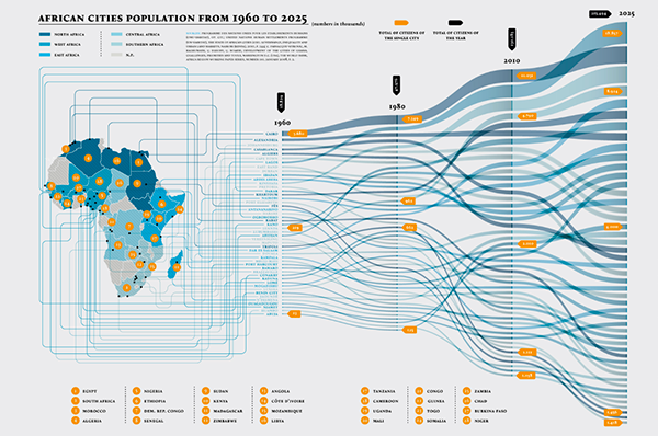
Alluvial diagram of the population of African cities from 1960 to 2025. Source: AFRICA - Big Change / Big Chance - Triennale di Milano
By Juan Pablo Garnica Munévar. Published: September 30, 2021.
What is an alluvial diagram?
The alluvial diagram is a type of flow chart that represents changes in a network structure over time. In that sense, it helps identify patterns and trends. It is named after the alluvial fan, a stream of water extending over an area that becomes flat, so it refers to both its shape and flow.
It works with categorical or qualitative variables, which are assigned to parallel vertical axes.
These axes have several values in the form of blocks. Each block has a particular size and,
flow streams pass through each with different proportions that change over time.
What is it used for?
According to the Data Viz Project, it serves to compare, correlate, distribute, and identify trends over time. Alberto Cairo considers flowcharts as alternatives to stacked area charts since they show a part of the whole and rankings.
Martin Rosvall and Carl T. Bergstrom consider it helpful in highlighting and summarizing significant structural changes in science, economics, and business.
Alluvial diagrams do not usually have labels for the value of the flow stream (the equivalent number), so you start from estimates in most cases. You can tell that one flow stream is more extensive than another, but not by how much. It gives you a general picture of the flows.
Titanic: what the water took with it
Michał Bojanowski is the creator of the “alluvial” package in the R programming language and of one of the most famous examples of alluvial diagrams: the demographic characteristics of those who survived and died after the sinking of the Titanic. The four variables he took into account were passage class, gender, age, and whether they survived.

Demographic characteristics of those who survived and died after the sinking of the Titanic. Source: Creating Alluvial Diagrams
The orange color identifies those who survived. From the visualization, we can compare which class had the most people, how many of them were of a particular sex, and the frequency of survivors.
If we focus on the blocks on the vertical axes representing the variables, we can see a stacked bar chart. The difference is that the variables are related and indicate their proportions: all the bars are classifications of the same data set. For example, we can know how many children were in the third class, male, and did not survive.
Recommendations

Alluvial diagram on changes in the fields of science. Source: Mapping Change in Large Networks
We can extract several recommendations from Martin Rosvall and Carl T. Bergstrom’s pioneering visualization of mapping change in science:
- Use colors to highlight a flow stream or component of interest. This is the case for neuroscience, as a discipline with a trajectory and becoming independent.
- The flow streams have an order according to their size. Rosvall and Bergstrom’s goes from smallest to largest, but the largest flow streams usually go first. However, take into account the position of the blocks to decrease the flow streams that pass through others and hide them.
- Flow streams should be curved, use gradients at junctions or divergences (more usual in Sankeys than in alluvial), and represent the significant changes (the largest ones) to make smooth transitions.
This type of visualization helps answer these questions: Which dimension or component in the form of a flow stream has the most changes over time? Which flow stream is the largest and is persistent throughout the visualization? What are the existing combinations of variable values?
Related visualizations
The Sankey diagram is a type of visualization similar to the alluvial diagram. Both are flowcharts. However, Ben Peterson, creator of DataSmith, warns of the differences between the two types. He points out that they can be confused by the flow streams, the movement of each other, and the blocks.
While alluvial diagrams start from the values taken by a component or flow stream through categorical variables (sex, age group, or population groups), the Sankey concentrates on the energy flow, i.e., its derivations and respective quantities. Moreover, its blocks do not necessarily meet at the same point. Finally, although Sankey diagrams are better known, alluvial diagrams are easier to make.
Data Viz Project considers the alluvial diagram to be a curved variation of parallel sets for categorical variables. Thus, it is also similar to the parallel coordinate plot, which corresponds to multivariate numerical data.
Check out the rest of our blog content. In there, you will find more information about other visualizations and newsletters on open government, journalism, and data culture. You can subscribe if you want to receive them twice a month in your inbox.
