How Charts Lie: Analysis and Examples from the Book Club

Yesterday at Data a la Lata, we held a book club to dive into one of the most relevant topics of the digital age: how charts can lie. We read How Charts Lie by Alberto Cairo—a book that encourages us to think more critically about the visual information we consume every day.
The Importance of “Graphicacy”
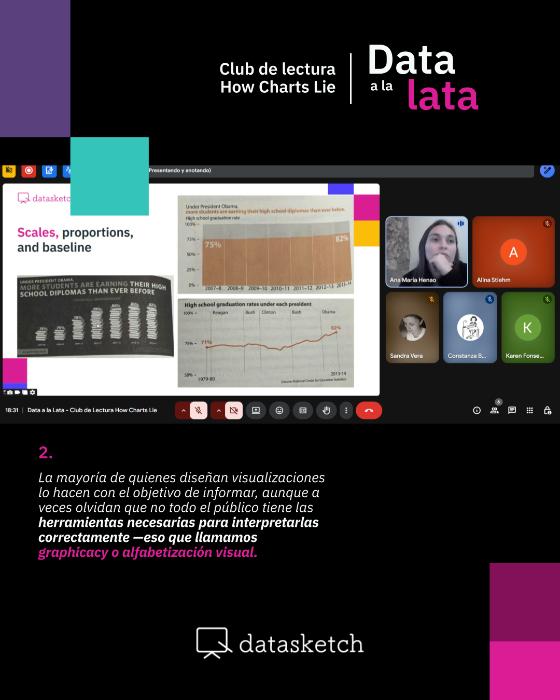
The meeting began with a reflection on graphicacy or visual literacy, a concept developed by geographer William Balchin in the 1950s that Cairo revisits in his book. Graphicacy refers to the ability to read, interpret, and create visual representations of data. To highlight the flaws in how charts are interpreted, Cairo cites a Pew Research Center survey revealing that 37% of people cannot correctly interpret a simple scatterplot—such as one showing the relationship between sugar consumption and tooth decay.
This statistic confronts us with a troubling reality: in a world where social media and technology constantly bombard us with visual information, many of us lack the basic tools to interpret it correctly. As discussed during the session, “even well-intentioned charts can be misinterpreted due to a lack of visual reading skills.”
Key Elements: Encoding and Scaffolding
Two fundamental concepts were explained during the session to understand how charts work:
- Encoding: The visual codes that transform abstract data into interpretable graphic elements such as color, position, height, angles, and area.
- Scaffolding: The labels, scales, and text that provide the necessary context to interpret the information.
Understanding these elements is the first step in identifying when a chart is misleading.
Examples from the Book
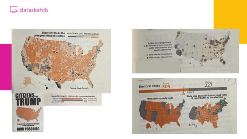
Political Maps
We analyzed the famous maps from the 2016 U.S. elections. Cairo shows how the county map favoring Trump created a false impression of Republican dominance by equating land area with population. Meanwhile, the Democratic bubble map only showed Clinton’s wins without revealing the margins of victory. According to Cairo, both visualizations fail because they mislead the viewer about what variable is truly being measured: neither accurately reflects the Electoral College system, which actually determines the result. This example highlights one of the central points of the book: charts become visual arguments that can reinforce preconceived beliefs rather than inform objectively.
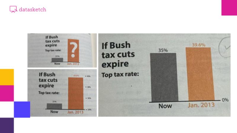
The Problem of Incorrect Scales
Cairo devotes special attention to one of the most common errors in data visualization: incorrect use of scales. A key example we analyzed was a 2012 Fox News chart showing the increase in the top income tax rate after Obama rolled back the Bush-era tax cuts. Visually, the bars suggested a massive increase—as if the rate had multiplied—but in reality, it was only a four percentage point rise (from 35% to 39.6%).
The core issue was that the Y-axis did not start at zero but only covered the 34% to 40% range, severely distorting the perception of actual change.
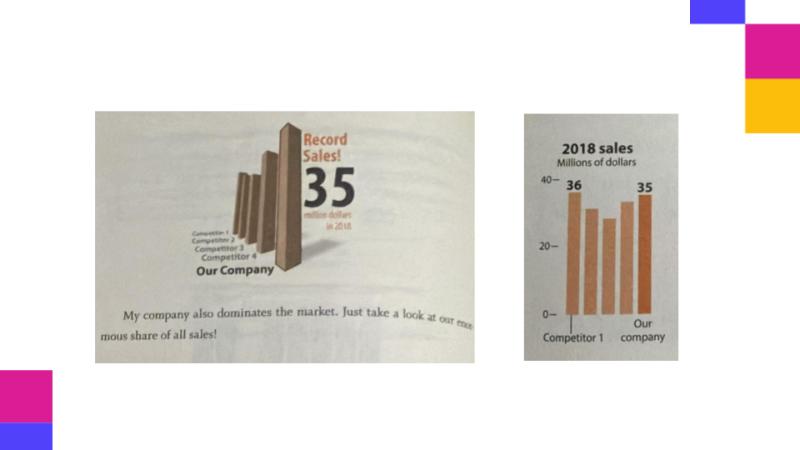
The 3D Perspective Trap
Cairo specifically warns about the dangers of 3D charts, dedicating an entire section to show how perspective can be misleading—even without malicious intent. Using fictional business sales data, he shows how a front-facing bar can appear taller due to perspective, creating the illusion that one company outperformed others when it actually did not.
The problem is that our brains interpret visual depth as importance or magnitude, but in 3D charts, this depth is purely decorative and holds no real information. Cairo demonstrates this by showing the same data in a flat, 2D format.
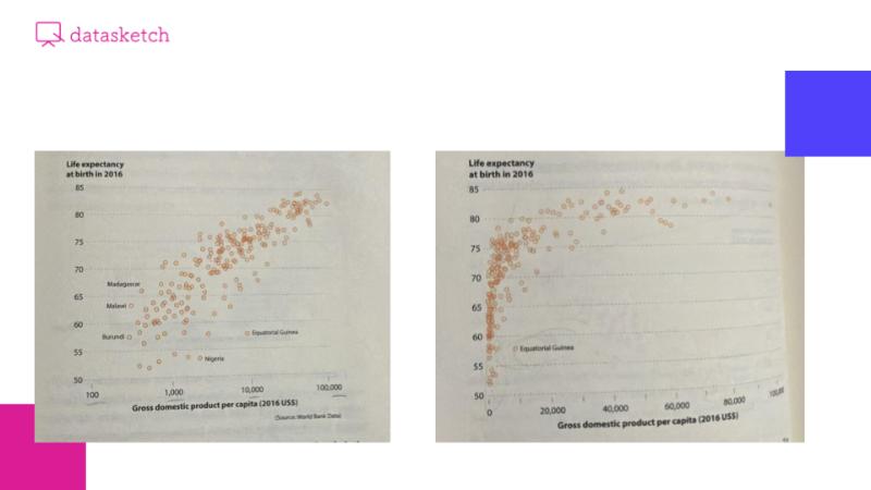
Logarithmic vs. Arithmetic Scales
An interesting discussion emerged around the use of different types of scales. Cairo demonstrates that logarithmic scales allow for better detection of patterns and anomalies in data with high variability, while arithmetic scales may compress most data points into one area, hiding valuable insights.
As one participant noted: “On a logarithmic scale, I can better see the distribution… whereas in arithmetic, it seems like everyone has almost the same values, but they don’t.” Cairo’s key message is that a logarithmic scale doesn’t “lie” when appropriately used with exponentially varying data. The key is to choose the scale that best reveals the real patterns—not to serve a specific message, but based on the nature of the data itself.
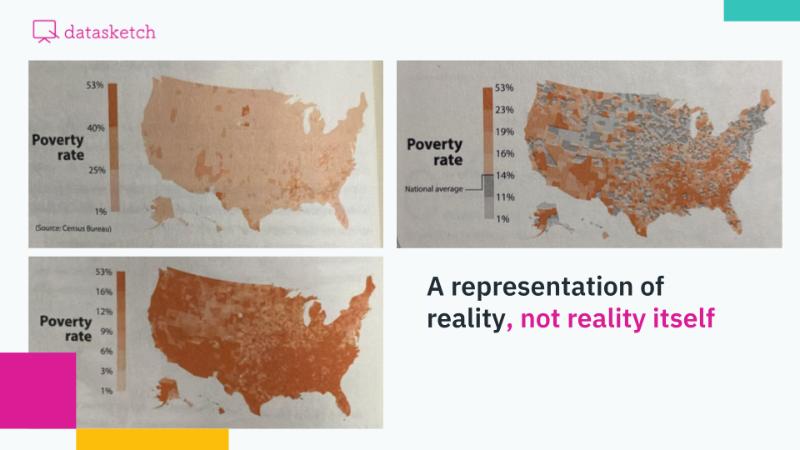
Choropleth Maps and Narrative Purpose
Cairo uses the example of poverty maps in the U.S. to show how “data can show whatever you want it to show” without technically lying. He presents two maps using the same poverty rate data, but with a different number of color categories. The first map, with only three categories (1–25%, 25–35%, 35–53%), suggests poverty is a localized issue, with very few dark-red areas. The second map, with seven more granular categories, shows most of the country in shades of red, suggesting a widespread crisis.
As one participant observed: “The more intervals in the color ramp, the faster it reaches darker shades,” which can exaggerate the perception of the issue. Cairo proposes a solution: use the national average (14%) as a baseline, color states below the average in gray, and reserve red for those that truly exceed the average. His central point: both maps are technically correct, but communicate completely different realities depending on the creator’s intent.
Map Projections: A Distorted Reality
Cairo addresses map projections as examples of visualizations that “seem to lie, but don’t.” The group explored how any attempt to represent a spherical Earth on a flat surface inevitably introduces distortion. Cairo compares the Mercator projection with equal-area projections like Peters or Gall-Peters to illustrate this dilemma.
An important point emerged during the discussion: “No projection perfectly reflects reality because the Earth is a geoid,” and as someone noted, “what matters is being aware of the limitations of map projections and the possible political intentions behind their use.”
Practical Exercise: Creating Misleading Charts
To close, a hands-on exercise was proposed inspired by Cairo’s method: intentionally create misleading charts using the concepts discussed. Just like the author—who uses fictional data to demonstrate manipulation techniques without spreading misinformation—participants designed examples illustrating various types of visual deception.
The results were diverse. One participant created a bar chart on rising crime, manipulating the scale to not start at zero, making a small increase look like a security crisis. Another designed a scatterplot mixing three variables (voter age, election year, and turnout percentage), where bubble size visually contradicted the Y-axis data, confusing the viewer about what the size actually represented.
The exercise demonstrated one of Cairo’s key messages: understanding how deceptive charts are built is essential for developing the critical thinking needed to avoid being misled by them. As one participant said at the end: “All of these charts highlight the importance of visual literacy—and remind us of the ethical dimension of information handling.”
Final Reflections
This Data a la Lata meeting reminded us that visual information is not neutral. Behind every chart are design choices that can either illuminate or obscure reality. In an era where misinformation spreads widely, developing our critical capacity to interpret charts is not just helpful—it’s essential.
The active participation of attendees enriched the discussion, showing that collective analysis strengthens our ability to detect bias and manipulation. As Alberto Cairo teaches us: the goal is not to distrust all charts, but to develop the tools to evaluate them critically, understand their context, and recognize the intentions behind their creation.
