Using maps to visualize data can seem complex at first. With so many varieties available, choosing the right one can be challenging if you’re not familiar with the topic. For this reason, at Datasketch, we explain how to use the three most common types: choropleths, points, and lines.
Choropleth Map: Visualizing Numerical Values in a Geographic Region
If you need to visualize numerical values across a geographic region (such as cities, states, or countries), a choropleth map is the ideal option.
These maps use colors to represent values, shading each area polygon based on its data, with greater or lesser intensity depending on the variable being analyzed. This allows for a clear and effective visual comparison of data across different locations.
One example is a choropleth map illustrating recorded traffic incidents in Mexico City. In this case, different city areas—specifically the boroughs—are color-coded to indicate the number of incidents: darker shades represent areas with more incidents, while lighter shades indicate fewer incidents.
Feel free to create your own choropleth map. Following our step-by-step guide on our blog.

Generally, it’s recommended to use a single-color gradient palette, following the logic of the previous example: darker tones for higher values and lighter tones for lower values.
Point Map: Locating Specific Places
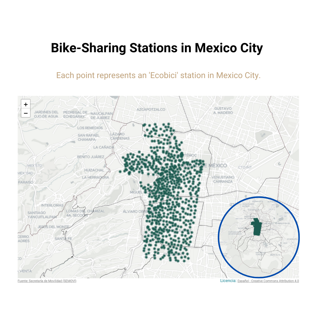
If you work with geographic information such as the location of different places within an area, a point map is the ideal choice. This type of map helps visualize how certain events or elements are distributed across a geographic space, such as the locations of stores, trees, or parks in a city.
A great example is a point map showing the locations of shared bicycle stations in Mexico City. This visualization highlights how access points are concentrated in the city center, while peripheral regions have little to no coverage.

Line Map: Visualizing Routes or Connections
Sometimes, what we need to represent is routes or connections, such as the movement of people or goods between different points.
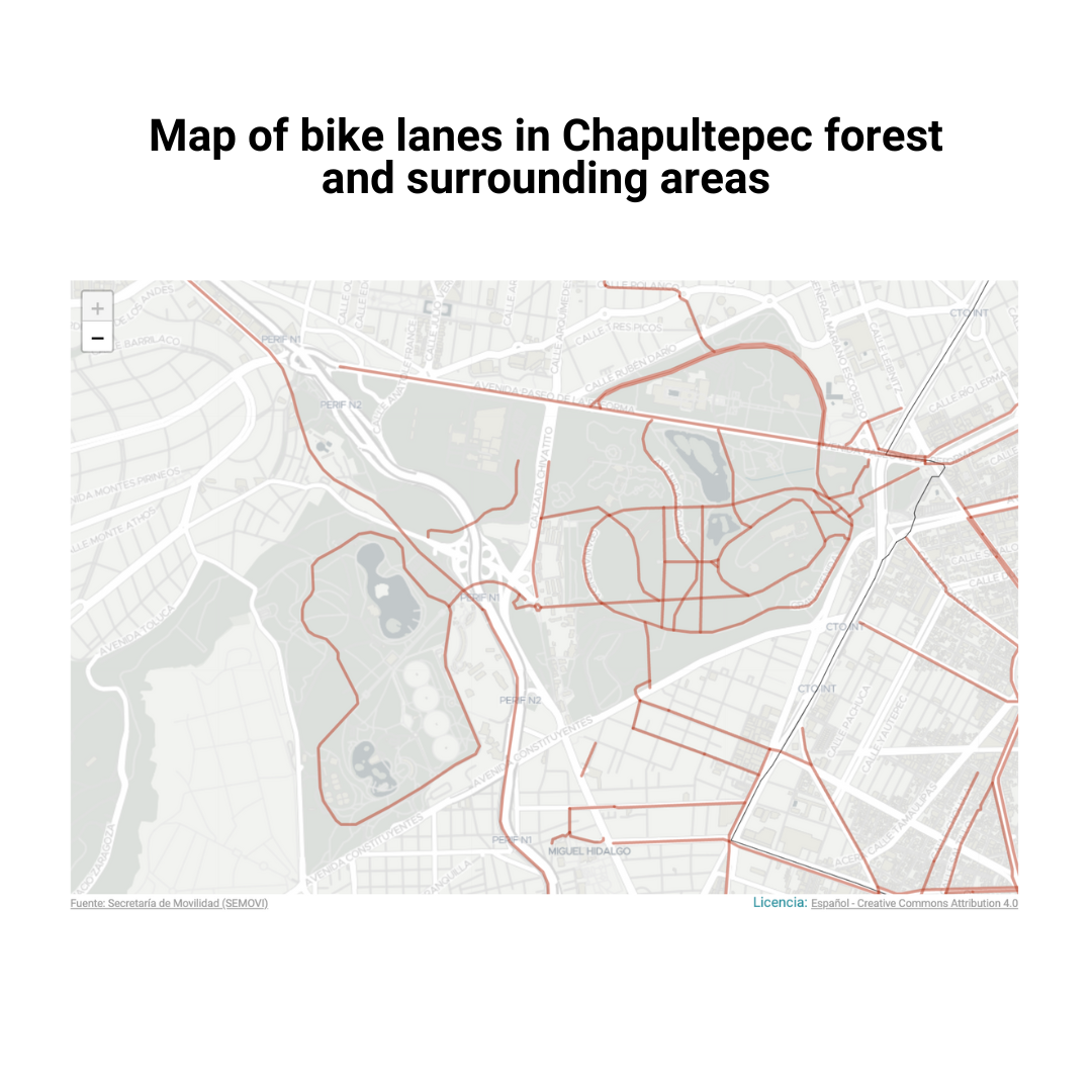
For these cases, a line map is an excellent choice. Line maps connect different geographic points with lines, showing direction and flow, making them ideal for transportation routes, migration flows, or network connections between locations.
An example of a line map illustrates cycling infrastructure in and around Chapultepec Forest in Mexico City, helping to visualize the network of bike paths available in the area.

All the maps featured in this article were created using the geographic visualizer from the Mexico City Open Data Portal, a project developed by Datasketch.
The right map choice depends on the nature of your data and the goals of your analysis. With these three types of maps, you can create data visualizations without unnecessary complexity.
If you’d like to explore data visualization further, visit our blog, where you’ll find additional resources and practical guides to help you improve your skills