5 Steps to Start Visualizing Data on Maps
If you want to start visualizing data on maps, there are a few basic things you need to know. It’s not just about placing points on a map, but understanding how files and formats work, and which type of map is best for each case. At Datasketch, we walk you through five essential steps to dive into the world of geospatial visualization.
- Use the correct map formats
To work with maps, you need special files that contain geographic information. The most common ones are GeoJSON, Shapefile (SHP), and KML. These formats allow you to represent points, lines, and polygons on interactive maps. If you download geographic data from official sources, it’s likely to come in one of these formats.
- Understand the difference between point maps and polygon maps
There are two main types of maps depending on the data: point maps and polygon maps.
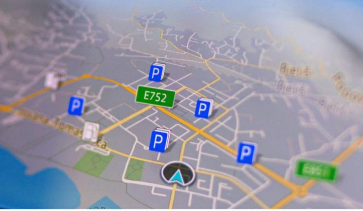
Point maps use latitude and longitude coordinates to locate specific elements. For example, if you want to show the location of trash bins in a city, each one would be represented as a point on the map, like in the following image.
Polygon maps, on the other hand, divide the territory into areas and let you visualize data grouped by zones.
A polygon can represent countries, departments, or neighborhoods—but also more specific areas like parks, plots of land, lakes, or any other surface outlined in the map file.
If you want to show which parks have the most visitors, each park (as a polygon) can be colored according to the number of people. This polygon will have the exact shape of the land it represents on the map.
For example, if you visualize parks in a Bogotá neighborhood, each one will appear as a polygon with its corresponding size and shape, as shown below.
- Find the right geographic data
Not all data can be turned into a map. To create a data visualization like this, you need spatial information such as coordinates or region names that can be linked to a geographic file.
Latitude and longitude coordinates are the most precise way to locate a point on the map. Latitude indicates how far north or south a place is from the equator, while longitude shows how far east or west it is from the Greenwich Meridian.
There are different formats for writing geographic coordinates: • Decimal degrees (DD): The most commonly used in visualizations and tools like Google Maps. It consists of two decimal numbers, one for latitude and one for longitude. Example: Bogotá is approximately 4.71, -74.07. • Degrees, minutes, and seconds (DMS): Uses degrees (°), minutes (’), and seconds (”). Example: Bogotá in this format is 4°42’36’‘N, 74°4’12’’W. • Degrees and decimal minutes (DMM): Similar to the previous one but without seconds. Example: 4°42.6’N, 74°4.2’W.
For most data visualizations, decimal degrees (DD) is recommended, as it’s easier to interpret and more compatible with mapping and analysis tools. You can get this data from open data portals or generate it yourself with geocoding tools.
- Choose the right tool for visualization
There are many tools for creating maps, from simple options like Google My Maps to more advanced platforms like QGIS, Mapbox, or Kepler.gl. If you want interactive maps without coding, tools like the Datasketch graph visualizer offer personalized options depending on the map you need—just choose the most appropriate settings. You can also use tools like Flourish or Datawrapper.
Explore these collaborative options that help you visualize data and build maps collectively.
- Match the visualization type to your story
Choose the type of map based on the story you want to tell. If you want to show events at specific locations, use a point map. If you need to compare regions, a choropleth map (colored polygons) might be the best option. Always think about clarity and the story your data should tell. Here’s a guide to 3 types of maps to start visualizing data.
Getting started with maps is easier than it seems. If you want to learn more about creating data visualizations, visit our blog for more tips and tricks. And if you’re ready to get hands-on, start building your own maps with our free data visualization tool. Start now!
