Boring Tables? Learn How to Improve Yours with These Tips

Tables are essential tools for organizing and presenting data due to their simplicity. However, they often lack visual impact and fail to communicate information effectively. If you’ve ever seen a table that fails to capture your audience’s attention or complicates data interpretation, this article is for you.
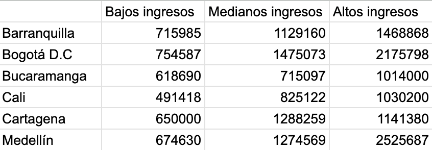
To illustrate, we’ll improve a table in Excel, a widely used tool for creating these visualizations. The table displays the average rental cost of a studio apartment in various cities in Colombia, categorized by income levels

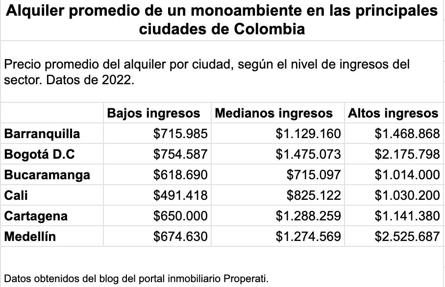
Add Contextual Elements
A well-designed table is much more than just a data container—it’s a powerful tool that enhances understanding. The first step is to ensure that the table’s purpose and the data it contains are clear.
- Clear Titles: Ensure the table’s header clearly explains its content.
- Footnotes: Include additional explanations or data sources when necessary.
- Numeric Formatting: Use commas or periods to separate thousands and decimals. This improves readability. Depending on your data and message, it’s best to limit decimal places to one or two.

Apply Visual Formatting
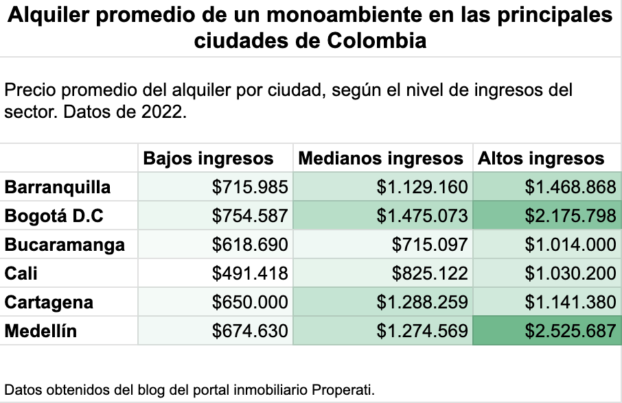
Visual formatting is key to making a table more engaging and easier to understand. Here are some tips:
- Use Strategic Colors: Highlight key cells with colors or shading, such as totals or significant variations. You can also apply a heat map to your table to enhance visual interpretation. Check out this tutorial to learn how.
- Incorporate Bars: Tools like Excel allow you to add horizontal bars within cells to represent values visually.

Simplify the Structure
An effective table starts with a clear and simple structure. If you want your audience to grasp the information quickly, follow these tips:
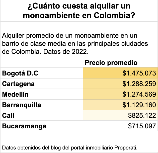
- Eliminate Unnecessary Elements: Show only relevant data. Remove rows and columns that don’t add value to the analysis.
- Divide and Conquer: If you’re analyzing different variables, it’s better to split them into smaller tables, presenting data independently when needed.
- Prioritize Order: Sort data from highest to lowest or lowest to highest, depending on the focus you want to give your table.

It doesn’t matter whether you’re designing a table using code or simply working in Excel—these recommendations can make your tables more attractive and easier to understand. With Datasketch’s app, you can also create this type of table. Try it now!