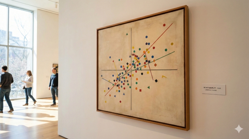
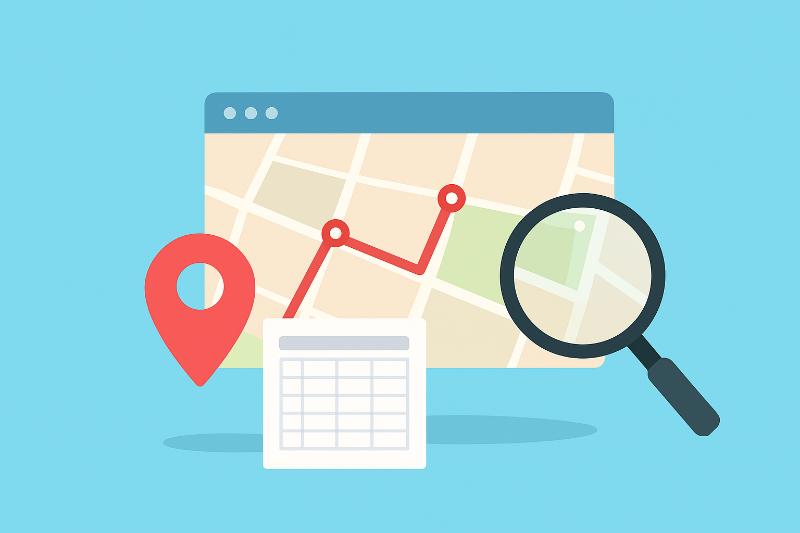
Data Visualization: Scatter Plot (or Correlation Chart)
At Datasketch, we walk you through everything you need to know to create scatter plots, also known as correlation charts.
Dec 23, 2025
General data science topics and concepts
At Datasketch, we walk you through everything you need to know to create scatter plots, also known as correlation charts.
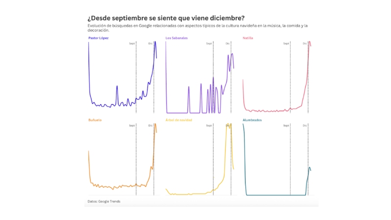
Read this blog to explore how Google searches reveal when interest in Christmas begins in Colombia.
A conversation with Economía para la Pipol on the Datasketch video podcast about data, technology, and economic storytelling.

At Datasketch, we’re exploring what AI can do, but always with a critical lens. Here are five everyday situations where you shouldn’t rely on it blindly.

At Datasketch, we’ll show you how you can integrate AI into your data workflow to save time and multiply your technical capabilities.

The information generated by AI tools is not neutral: it reflects the biases present in the data and in design decisions. At Datasketch, we explain the different types of biases and how to identify them

Based on the conversation in our videopodcast, we share the main lessons and challenges we’ve encountered at Datasketch over the ten years since our founding.

Discover the top 3 free tools to turn your audio into text—fast, accurate, and easy to use.
In this blog, we share how opening, integrating, and leveraging the data produced by academia can transform research and amplify its impact.
At Datasketch, we explain what you should keep in mind about geographic file formats when creating maps.

Here’s how to create a pictorial chart to visualize percentages in a creative and engaging way.
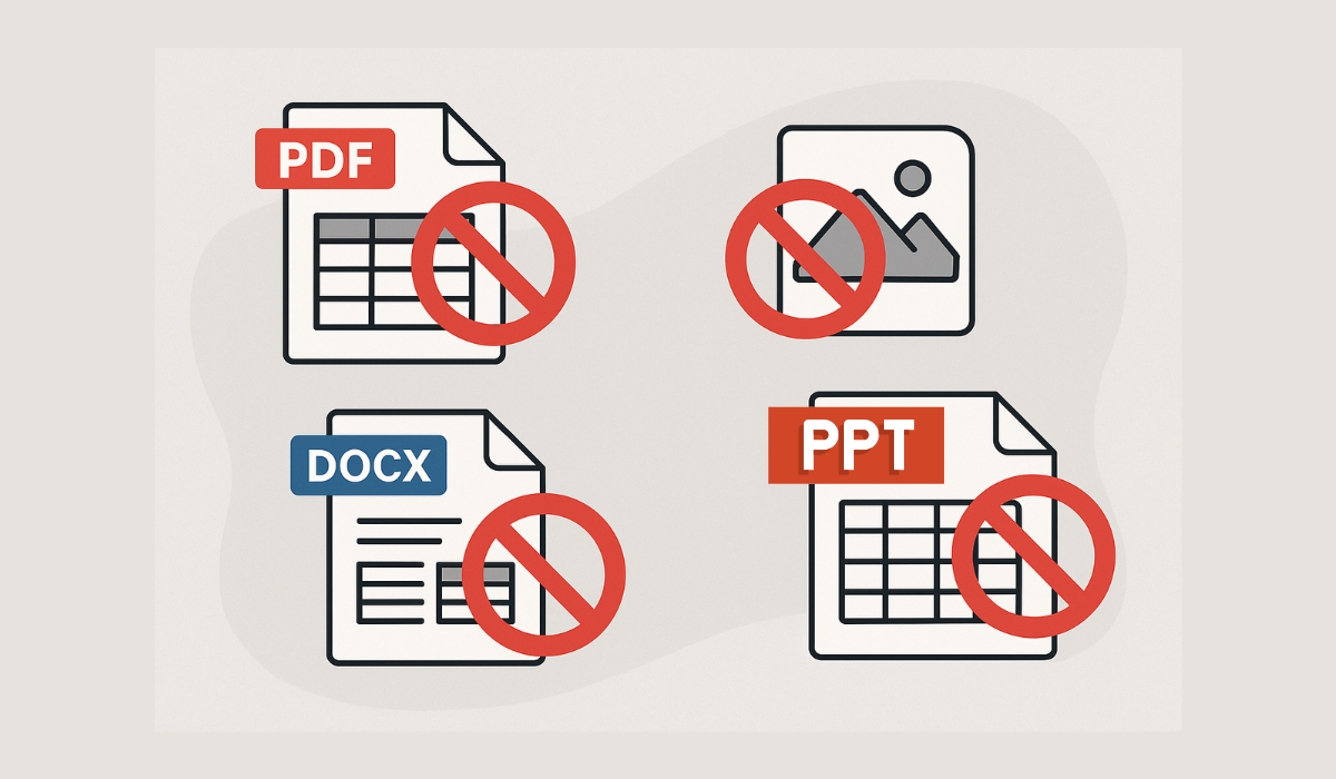
When working with data, certain file formats can create unnecessary complications. In this post, we’ll show you which ones to avoid.

Learn how to generate color palettes from an image using our Image Palette extension

Have you ever designed a Sankey diagram only to find it confusing? Chances are, you're making one of these mistakes. Avoid them!
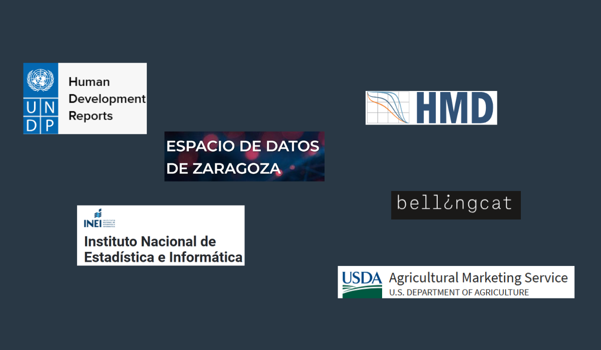
Explore the complete list on our platform and find the data source you need for your next project, report, or investigation.

Despite the many challenges social organizations face when working with data, those that overcome them can unlock new ways to scale their mission and amplify their impact. Here's how.
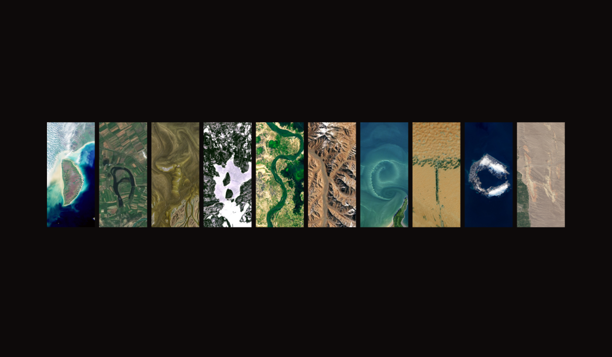
Would you like to access satellite imagery data but don’t know where to start? This blog will give you all the information you need.
At Datasketch, we’ve selected nearly 100 key terms to help you understand data and technology. Here’s why we did it—and why it might be useful for you.
At Datasketch, we believe in the power of data to drive social impact. Here are five recent projects we’ve contributed to.
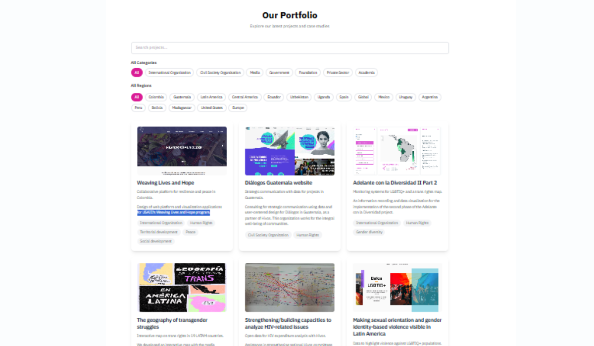
At Datasketch, we've worked with organizations from Mexico to Uganda. Learn more about our work in 100 projects.

We analyzed the data from the events we've participated in—both as organizers and guests—throughout our ten years of existence.

Here we explain what open data portals are and how their existence promotes transparency
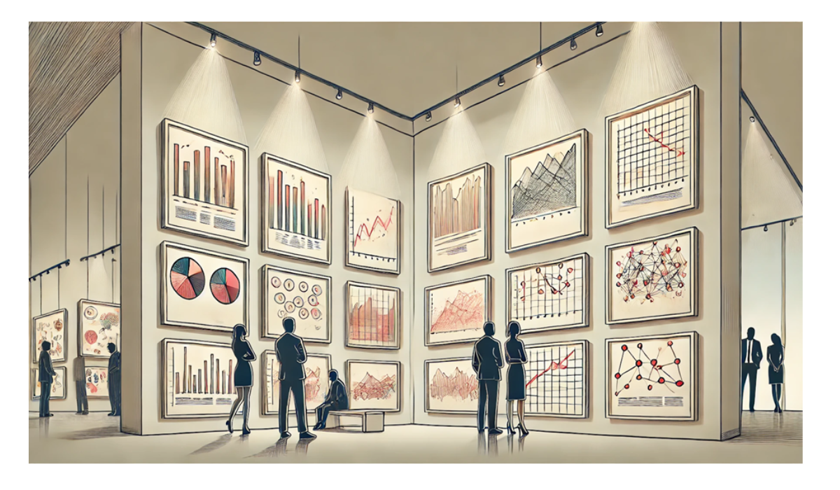
Discover more than 100 ways to visualize data in our gallery

Find out which countries have historically emitted the most CO₂ from fossil fuels and industrial activity.

How we did in our event to explore New York City's Spanish-language publishing ecosystem through a data lens.
Documenting the journey of selling $500,000 in 3 months.
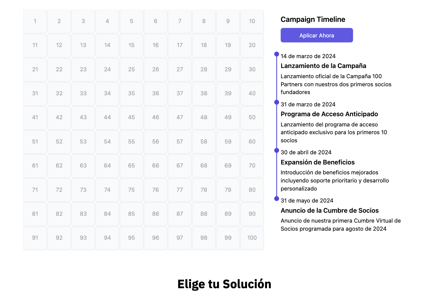
We are launching an ambitious campaign to partner with 100 organizations in 100 days, offering AI-powered tools to democratize data analysis. Join the revolution!
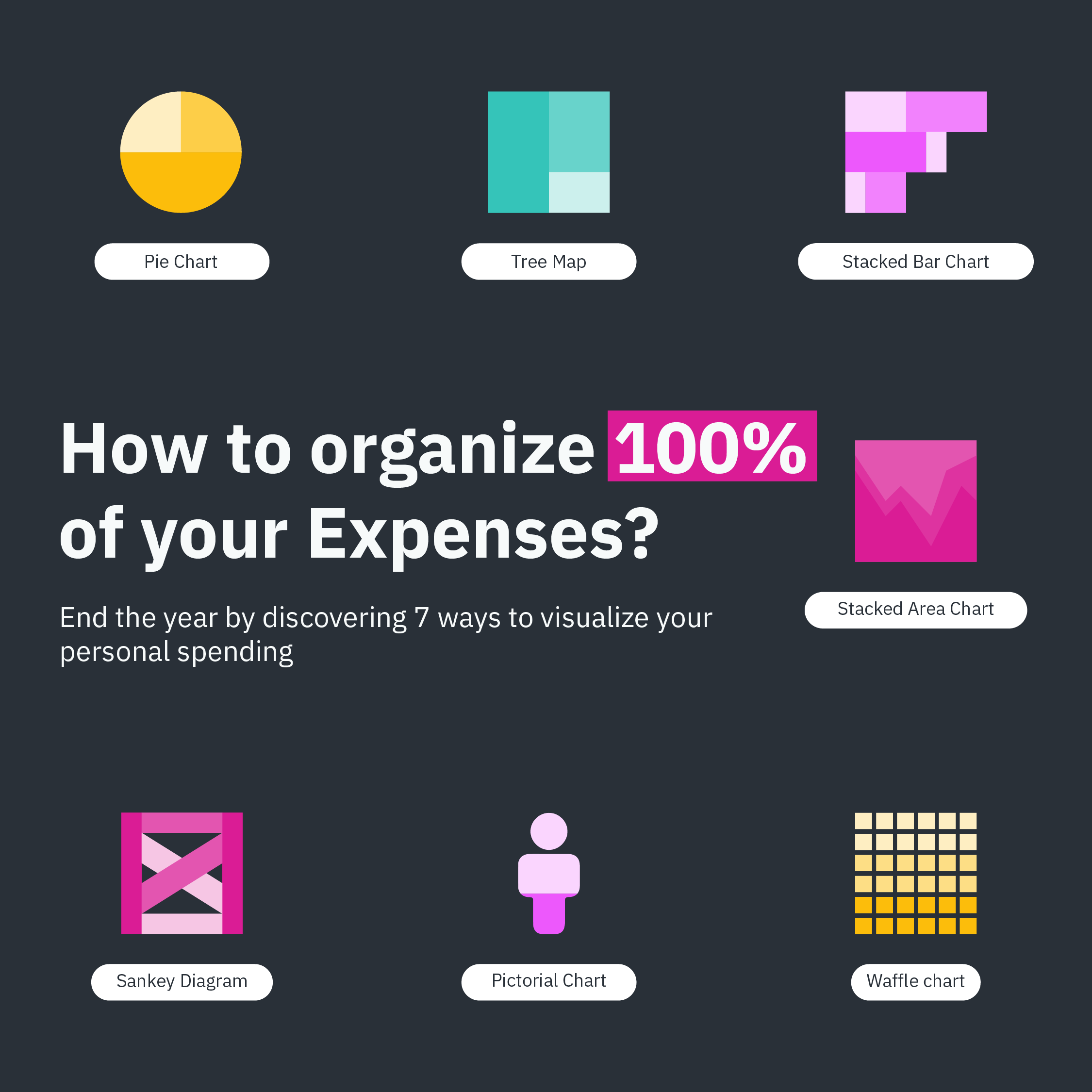
Choosing the right chart is key to visualizing our data in the clearest and most powerful way possible. For this reason, at Datasketch we present seven types of charts you can use to represent data that sum 100%.
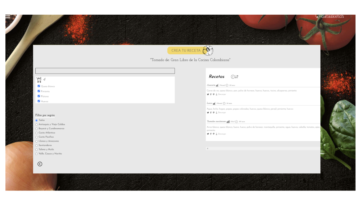
Colombian gastronomy knowledge, documented for decades in the Great Book of Colombian Cuisine, remained in a traditional format that limited its access and analysis. Through text extraction, data cleaning, and validation by culinary experts, we have transformed this culinary heritage into a dynamic tool that allows exploration, analysis, and discovery of more than 700 traditional recipes.
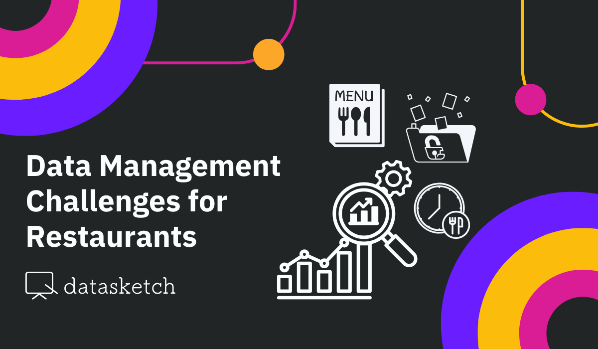
Digital transformation has led restaurants to face an unprecedented amount of information that needs to be managed. Currently, these businesses face the challenge of converting large volumes of data into strategic decisions that drive their growth. We present five challenges that food establishments face in managing their data.

América Abierta is one of the most anticipated events on open data in the region. In this article, we share details about the contribution Datasketch will bring to the event.
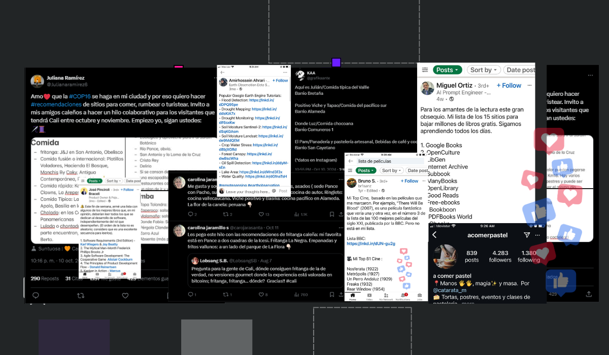
Small data is everywhere on our social media feeds: from saved recipes on Instagram to recommendation threads on X (formerly Twitter). While these individual pieces of data might seem insignificant on their own, they become powerful sources of information when organized and connected. In this article, we explore the power of small data and how organizing it can transform personal experiences into collective knowledge.

A tech revolution is brewing for small businesses, and at Datasketch, we're leading the charge. Our mission is to democratize data science and artificial intelligence (AI), making these advanced tools accessible to enterprises of all sizes.

At Café Datasketch, we combine gastronomy with data technology. Our menu continuously adapts through data-driven decisions, offering dishes that stand out for their flavor, sustainable origins, and social value. With our app, every change is automatically updated in the menu, without the need for additional resources, optimizing daily operations and enhancing our customers' experience.

Until the Rio 2016 edition, Colombia has earned a total of 8 medals (represented by each figure) in the weightlifting category at the Olympic Games since 2000 when María Isabel Urrutia won gold. The height at which each weight is lifted corresponds to a different type of medal: the highest is gold, the middle is silver, and the lowest is bronze. In the Tokyo 2020 edition, Luis Mosquera added one more medal to our count, which is why we updated the database that inspires this design.
Media | Public Procurement | Elections
Migration | Human Rights | Xenophobia
Economy | Sustainability | Aging
Rights | LGBTIQ+ | Americas
It’s simple and fast. Let’s start.
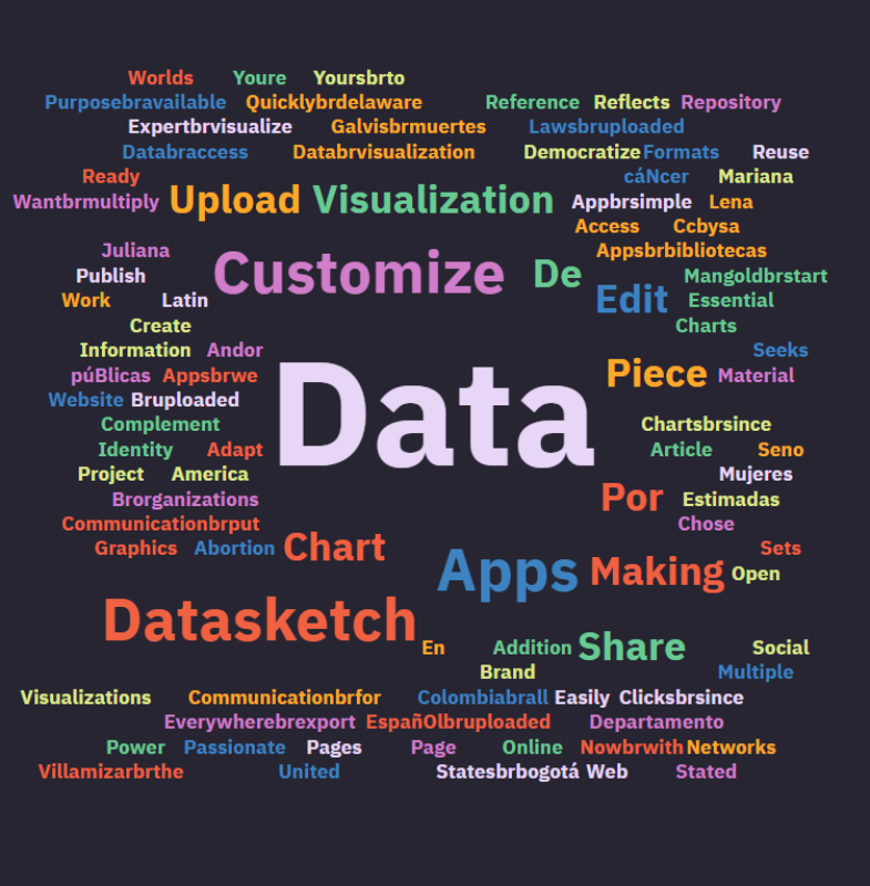
Data visualization is usually related to graphical representations of numbers, but when the information to be displayed is textual you can use a word cloud.
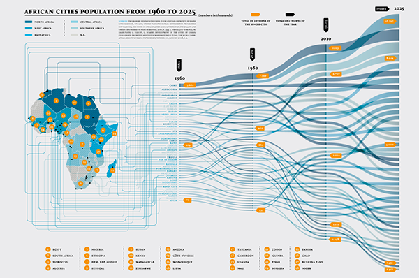
An alluvial diagram or alluvial plot is a type of visualization that shows changes in flow over time. We explain what they are used for and give you recommendations for their use with some examples.
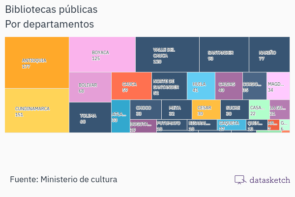
Treemap is a type of data visualization that displays data hierarchically. Here you will find its features, functions, recommendations, related visualizations, and entertaining examples.
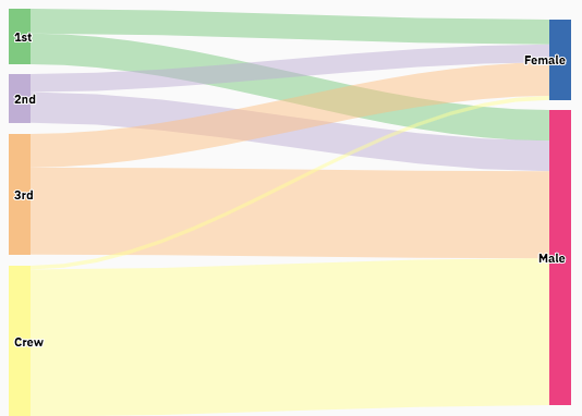
The Sankey diagram is a type of data visualization that allows you to graphically represent the flow from one series of values to another.We tell you how and when you can use it and show you how other people are using it.

We explain to you their characteristics, possible uses, and the different types of bar charts.
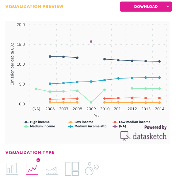
Learn how to use a line chart and when, its advantages and disadvantages and which of our apps to use to make it.
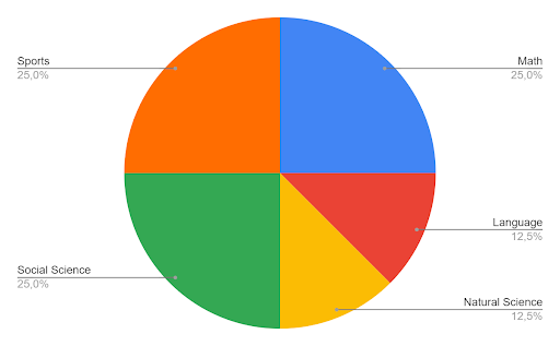
The pie chart is a pictorial representation of data that makes it possible to visualize the relationships between the parts and the whole of a variable. Learn how and when to use it.
